Head To Toe
Deliverables: Updated Logo, Brand Strategy, Visual Identity, Merch Design
BRIEF
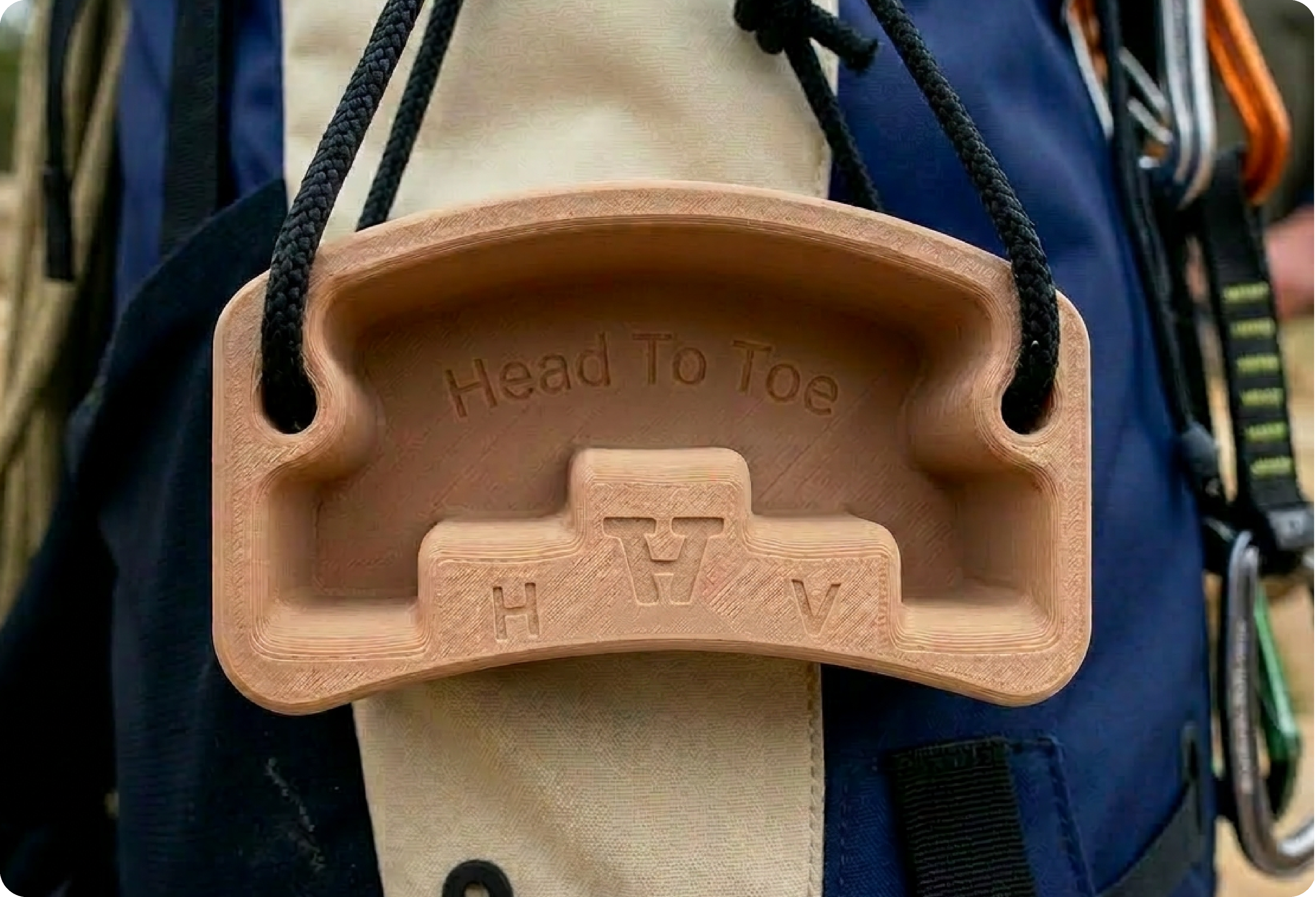
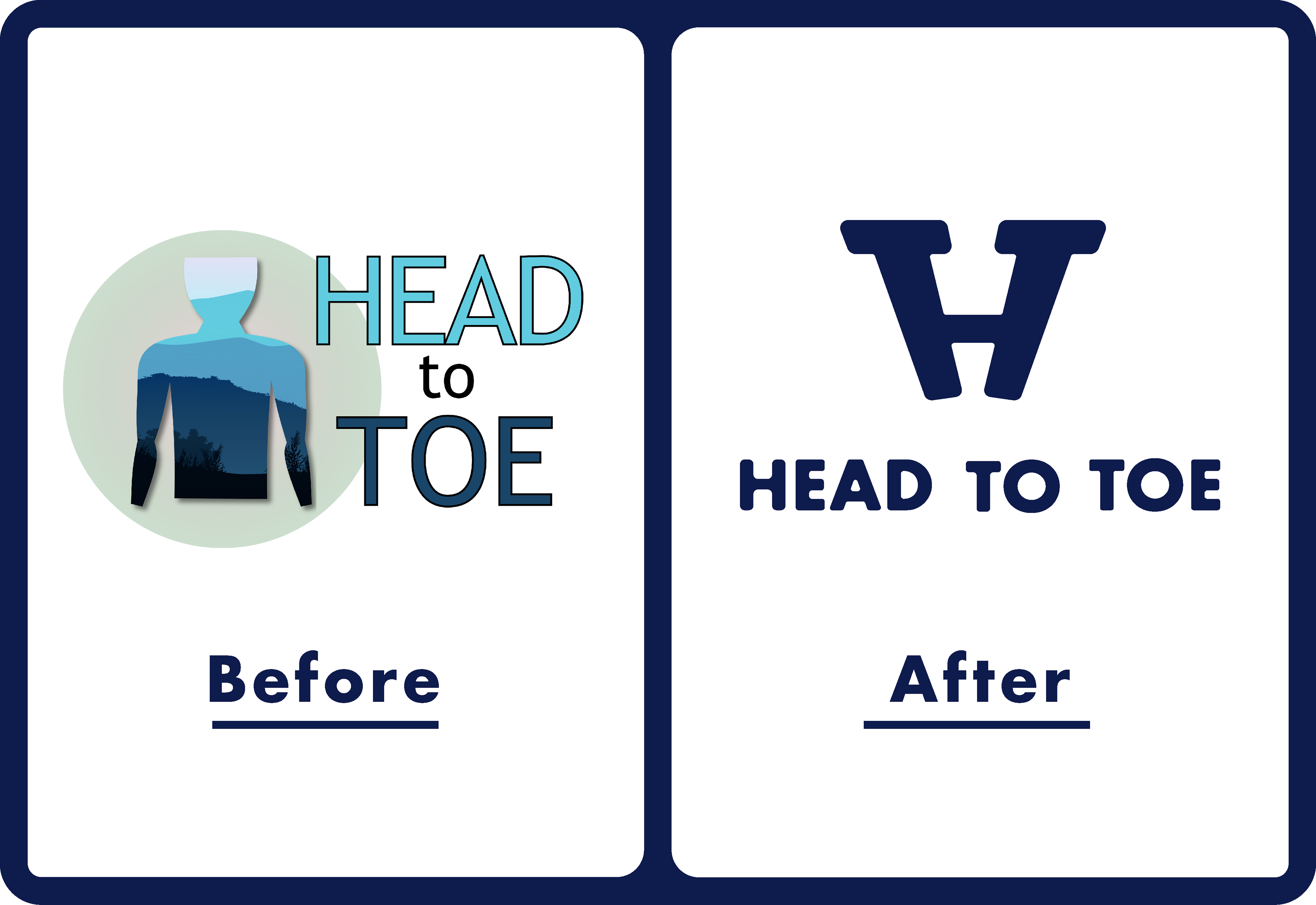
When Trevor and I first met about this project, he already had a great line of products and a strong vision, but needed help finding a visual identity that matched his growing brand. After introducing the first “unlevel edge” hangboard to the rock-climbing market, he had continued to create grip-strength trainers that helped athletes build strength, improve performance, and feel more connected to movement outdoors. However, his original logo no longer matched the direction of the Head To Toe brand, and he was searching for a new direction built from the ground up.
SOLUTION
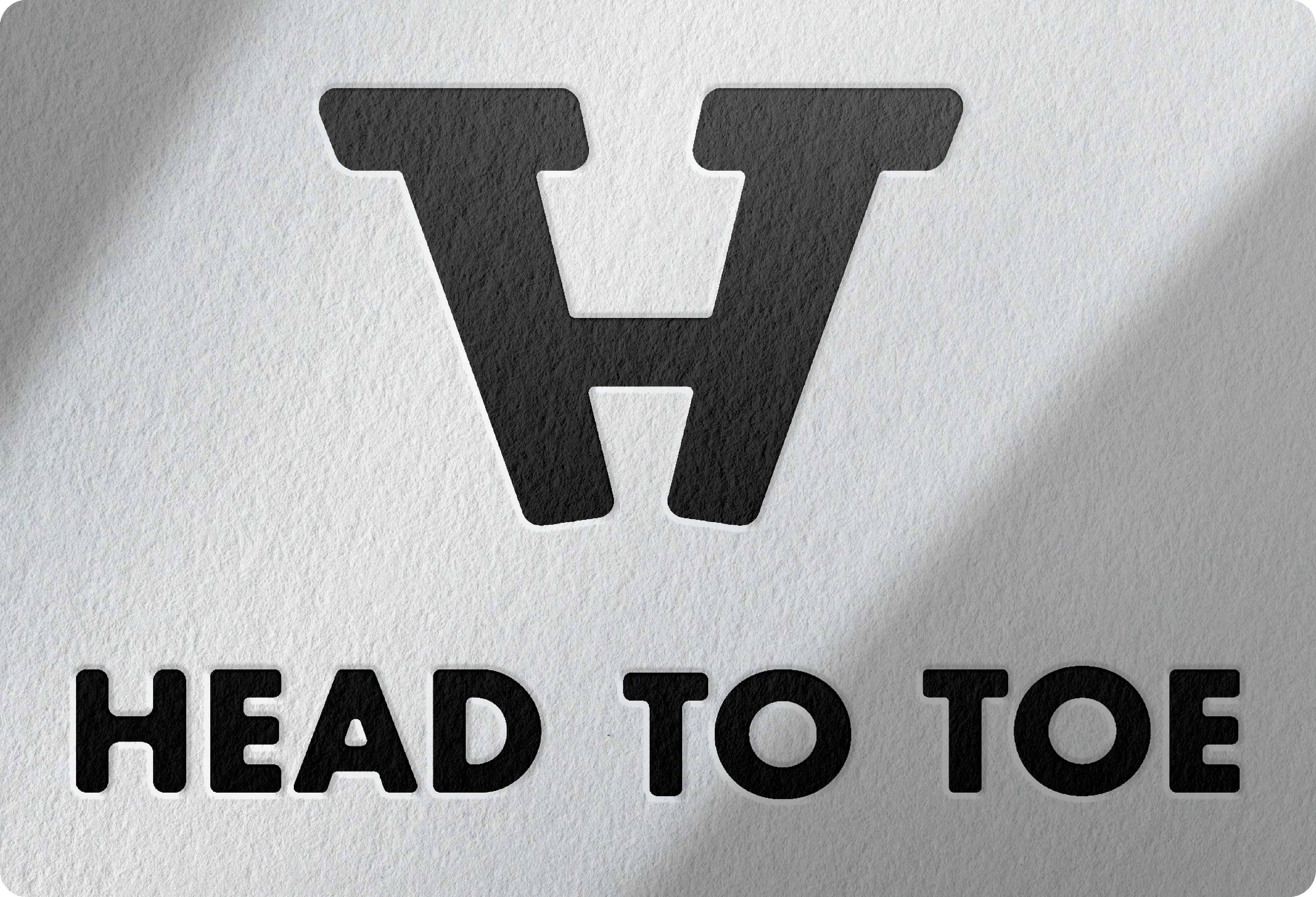
We focused on stripping the identity back to its core ideas: strength, body positioning, and unlocking potential. Early concepts explored full-body references more directly, but the final mark became more abstract - using form and tension to communicate performance rather than relying on a literal climber illustration.
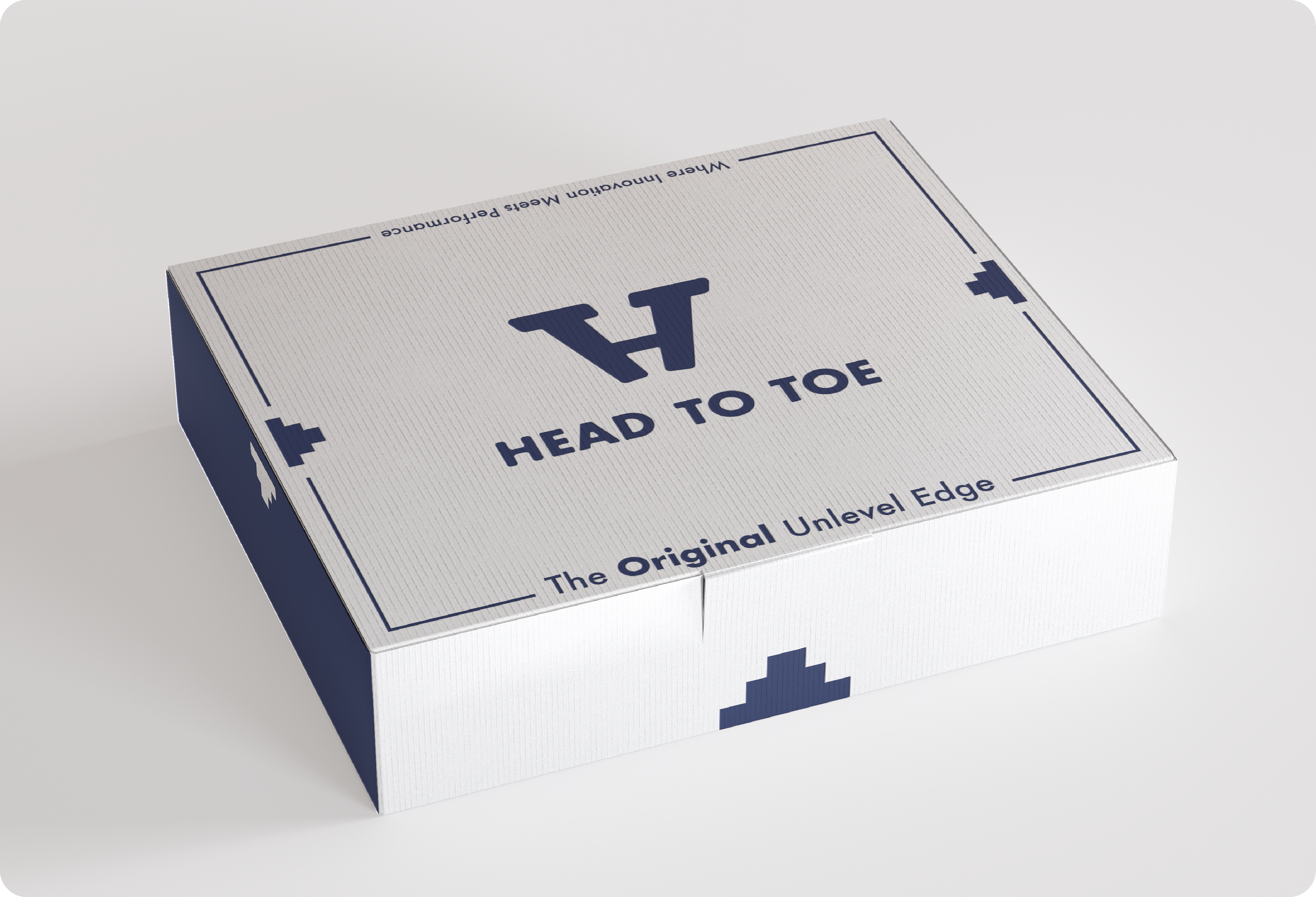
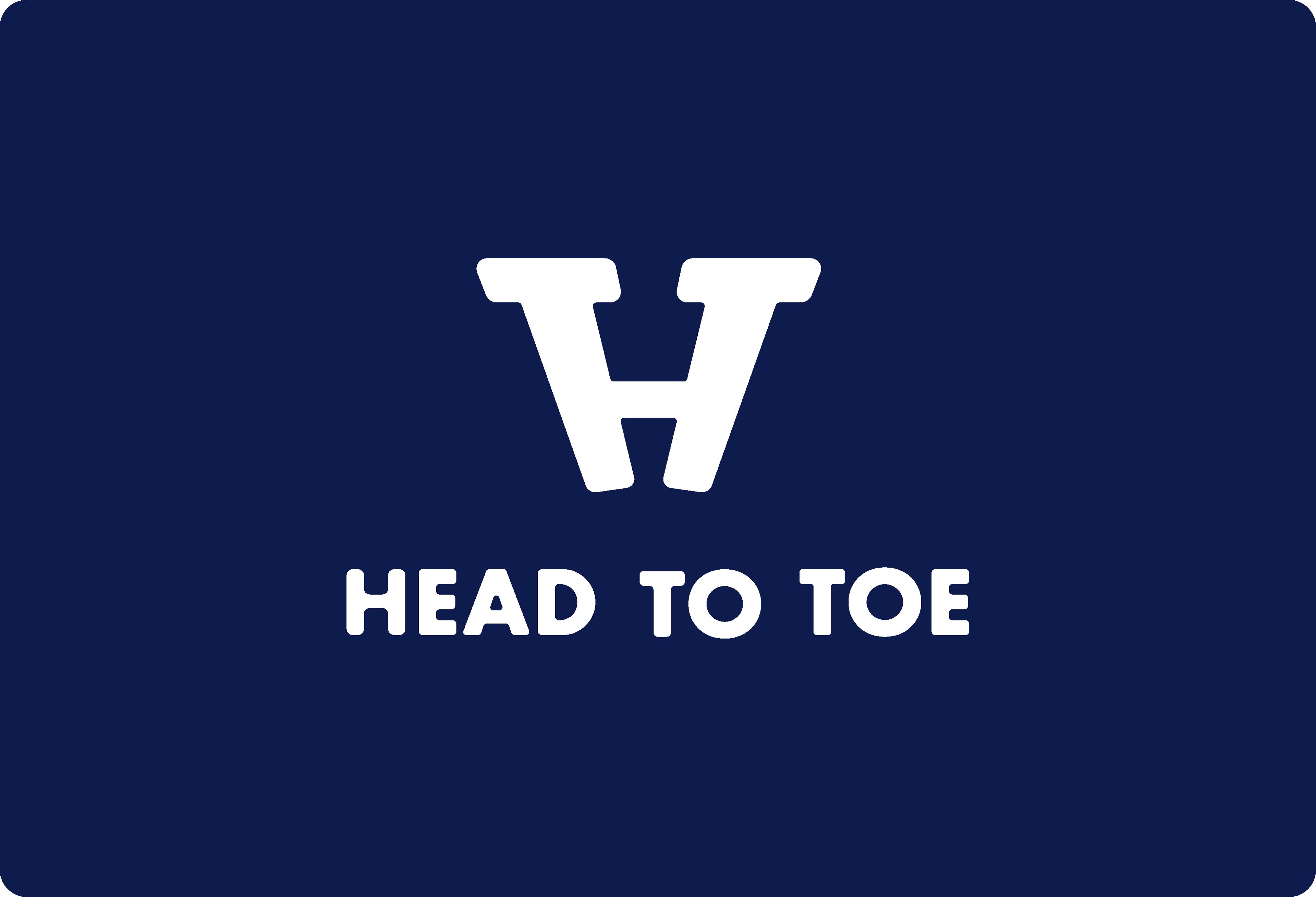
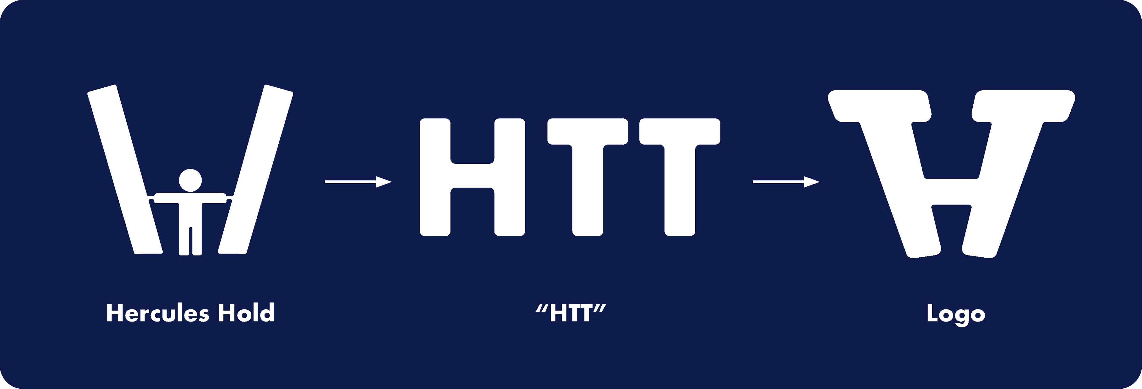
The final logo was inspired by the Hercules Hold seen in strongman competitions, where grip strength and core stability work together under tension. The central crossbar of the “H” represents grip force holding the structure upright, while the capped vertical forms subtly create two “T” shapes, allowing the mark to also function as an HTT monogram.
OUTCOME
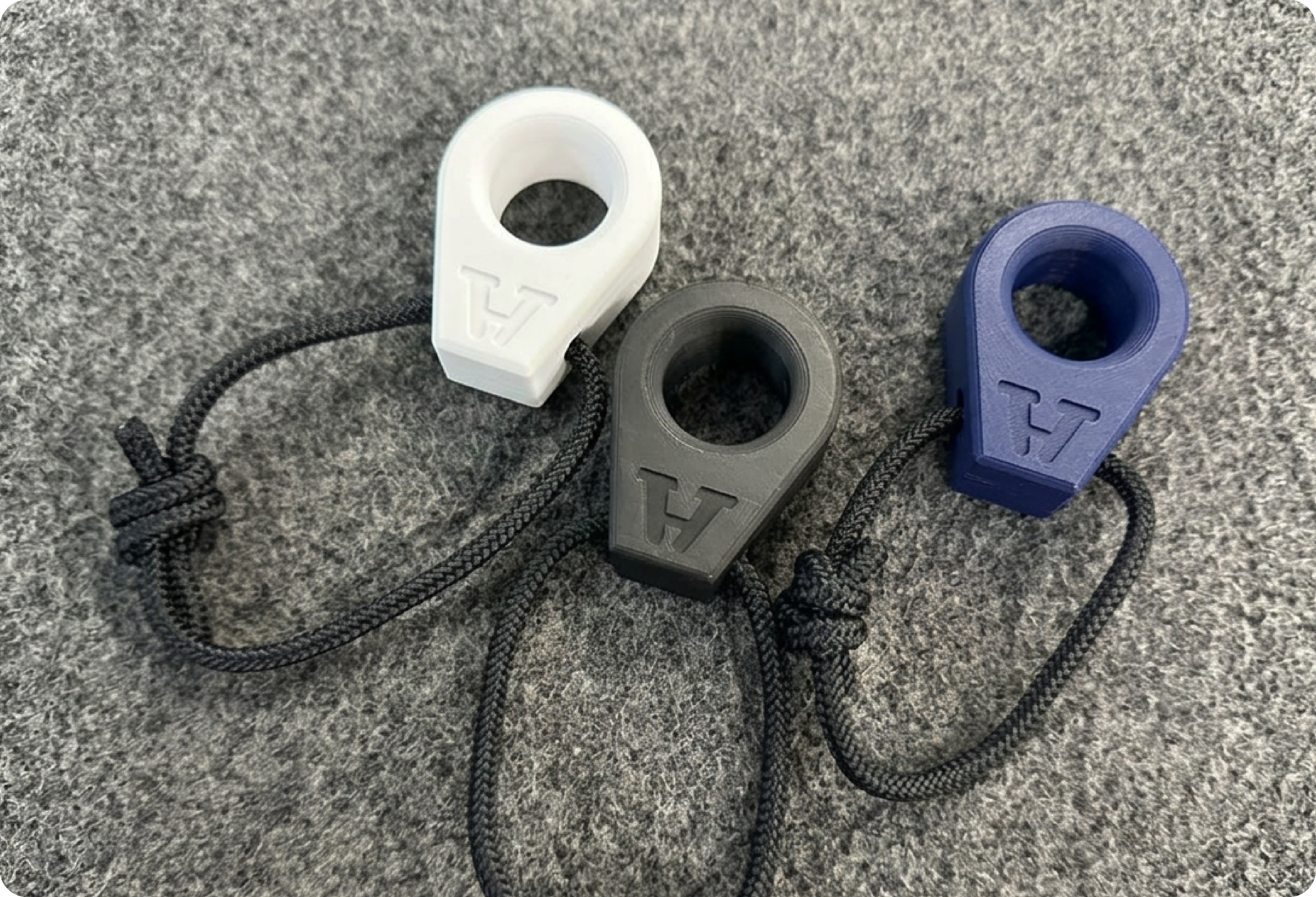
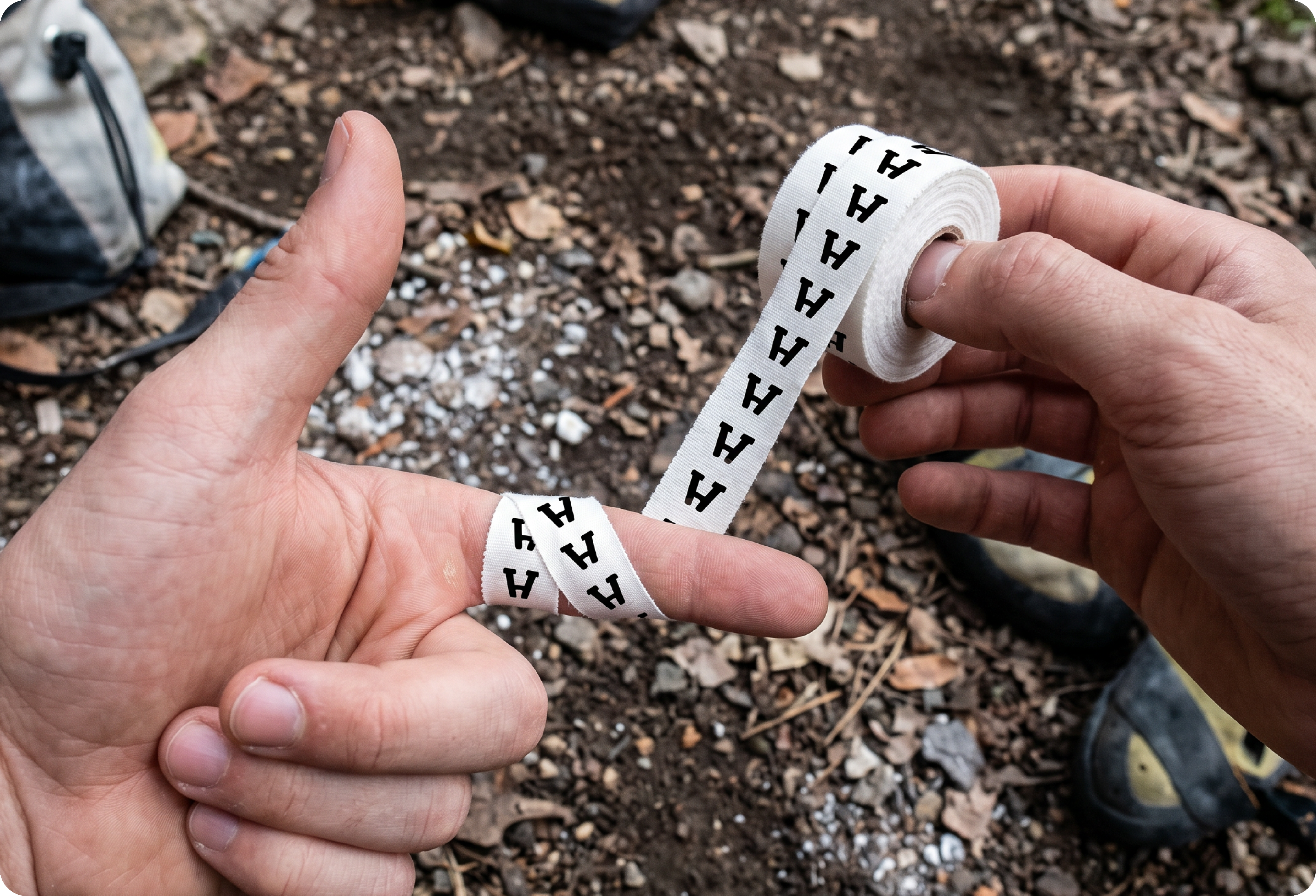
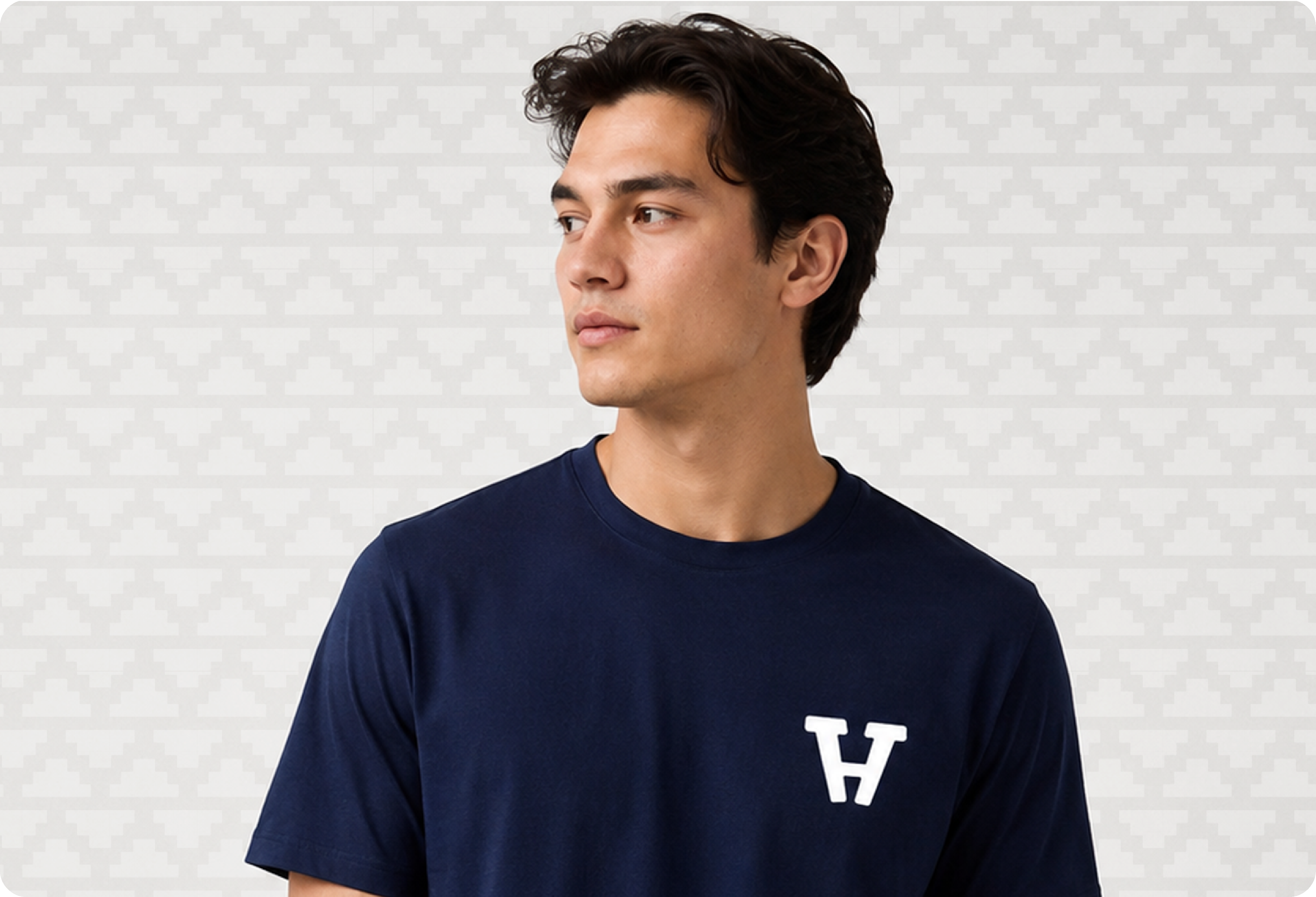
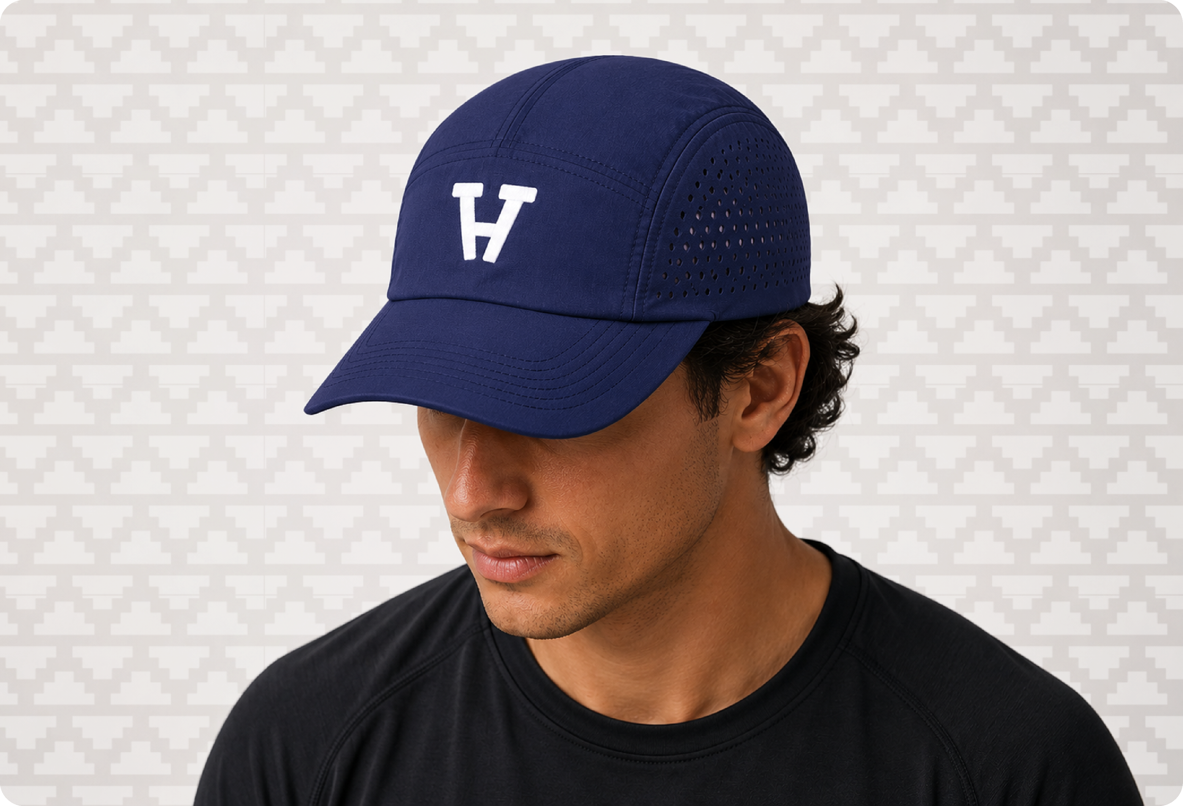
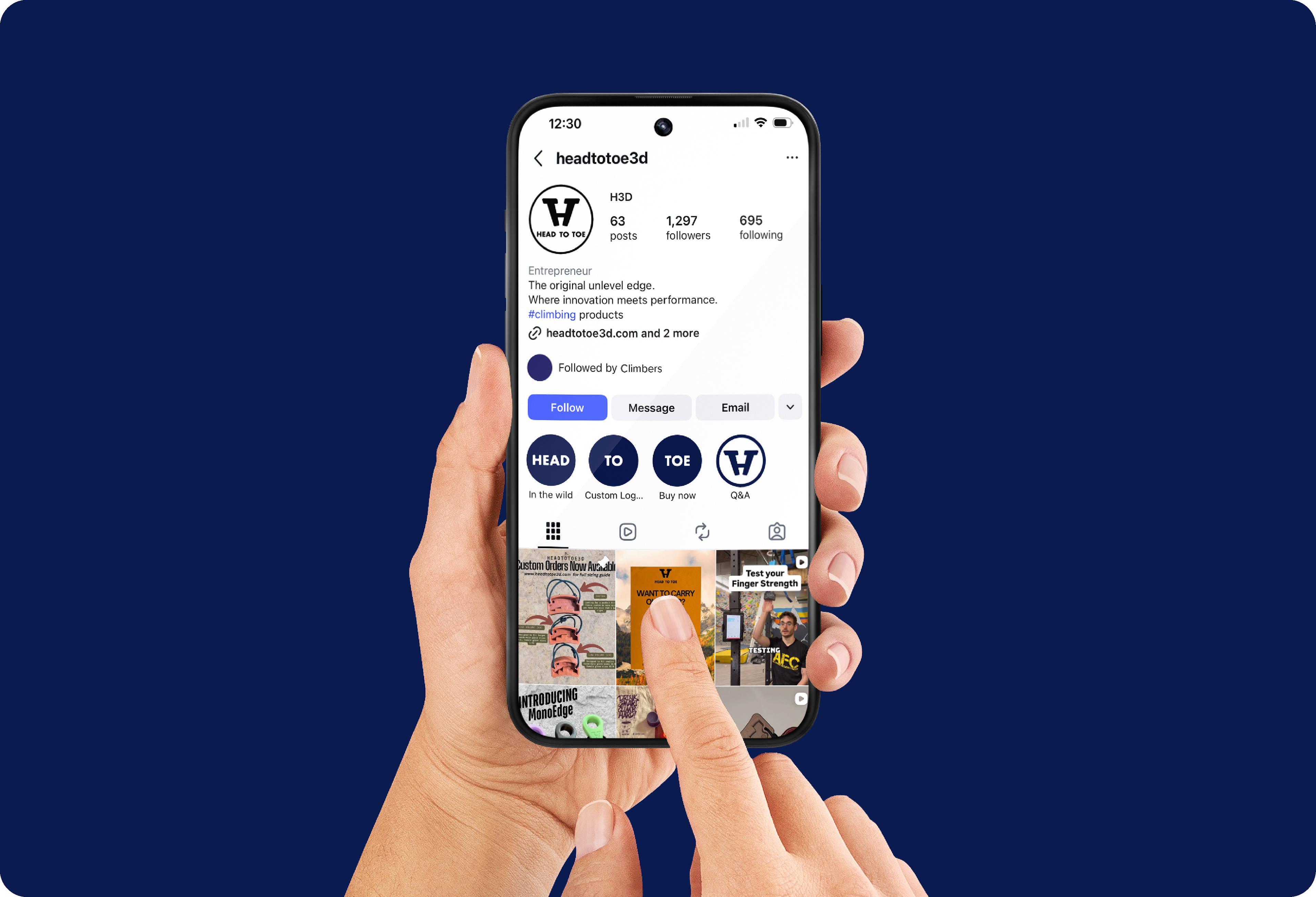
The new identity gave Head To Toe a stronger and more versatile brand system that could comfortably extend beyond the climbing market while still feeling rooted in strength training and performance. The mark translates seamlessly onto products, packaging, and digital applications while helping the company present itself with far more clarity and confidence.
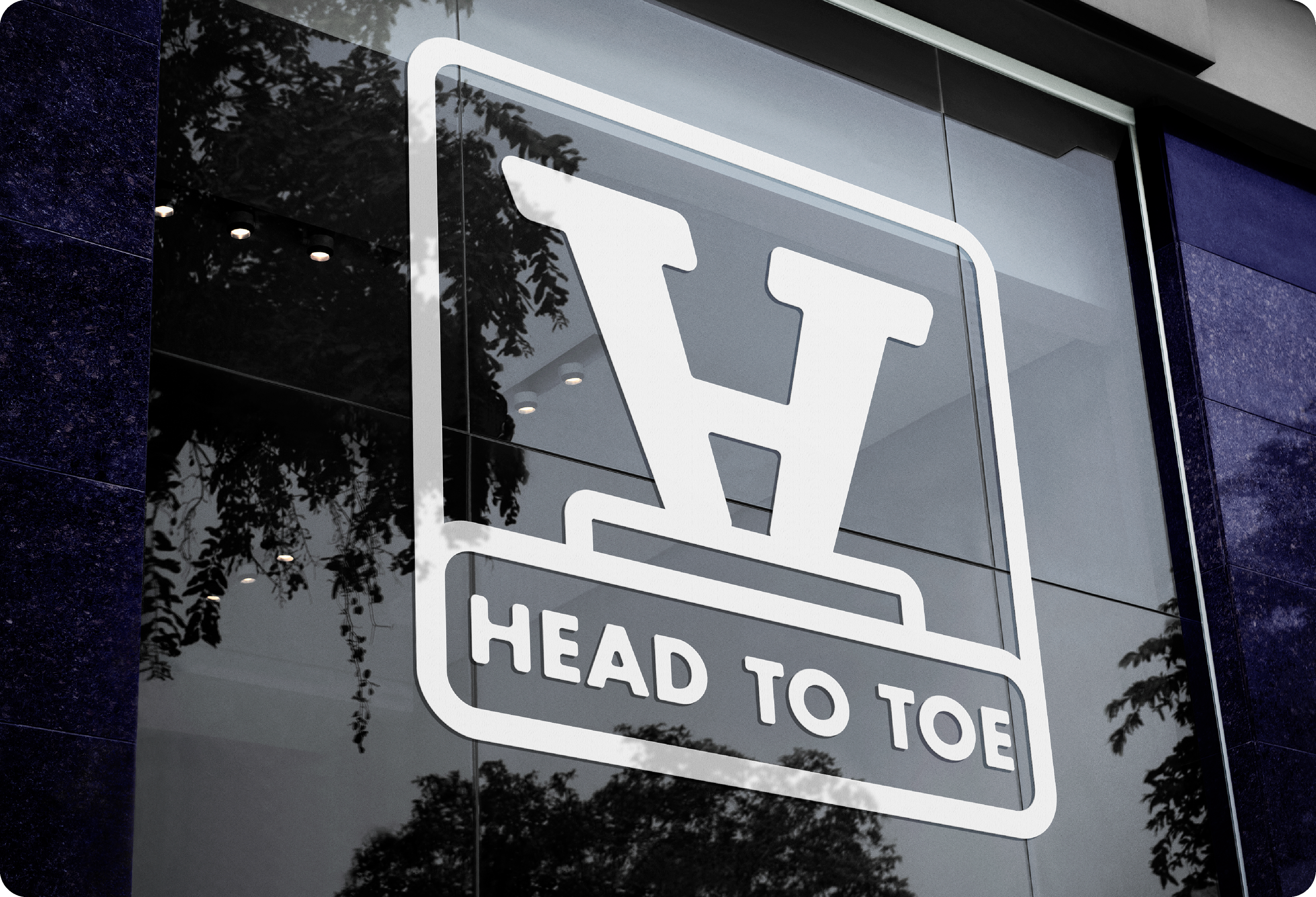
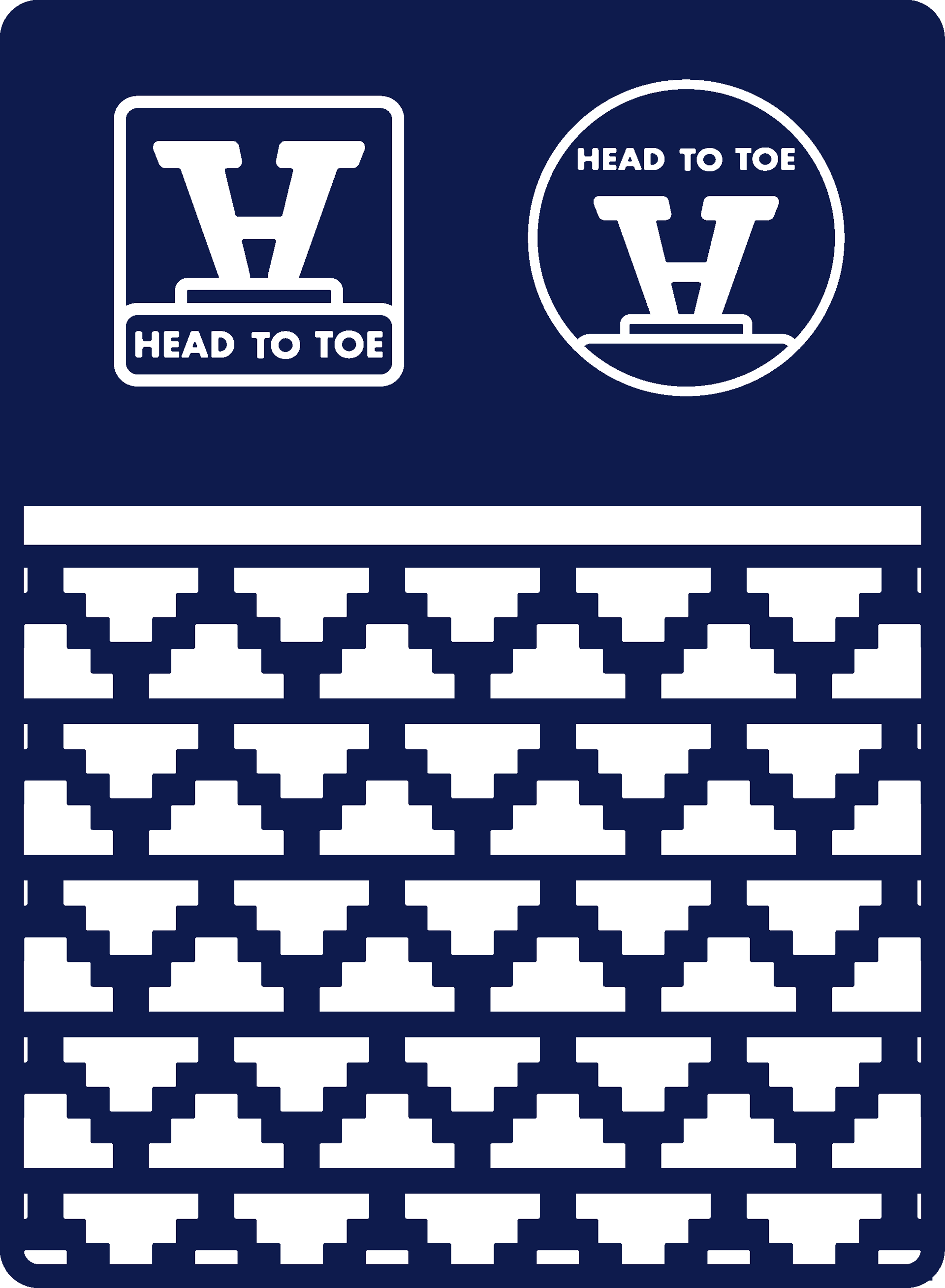
Secondary Logo
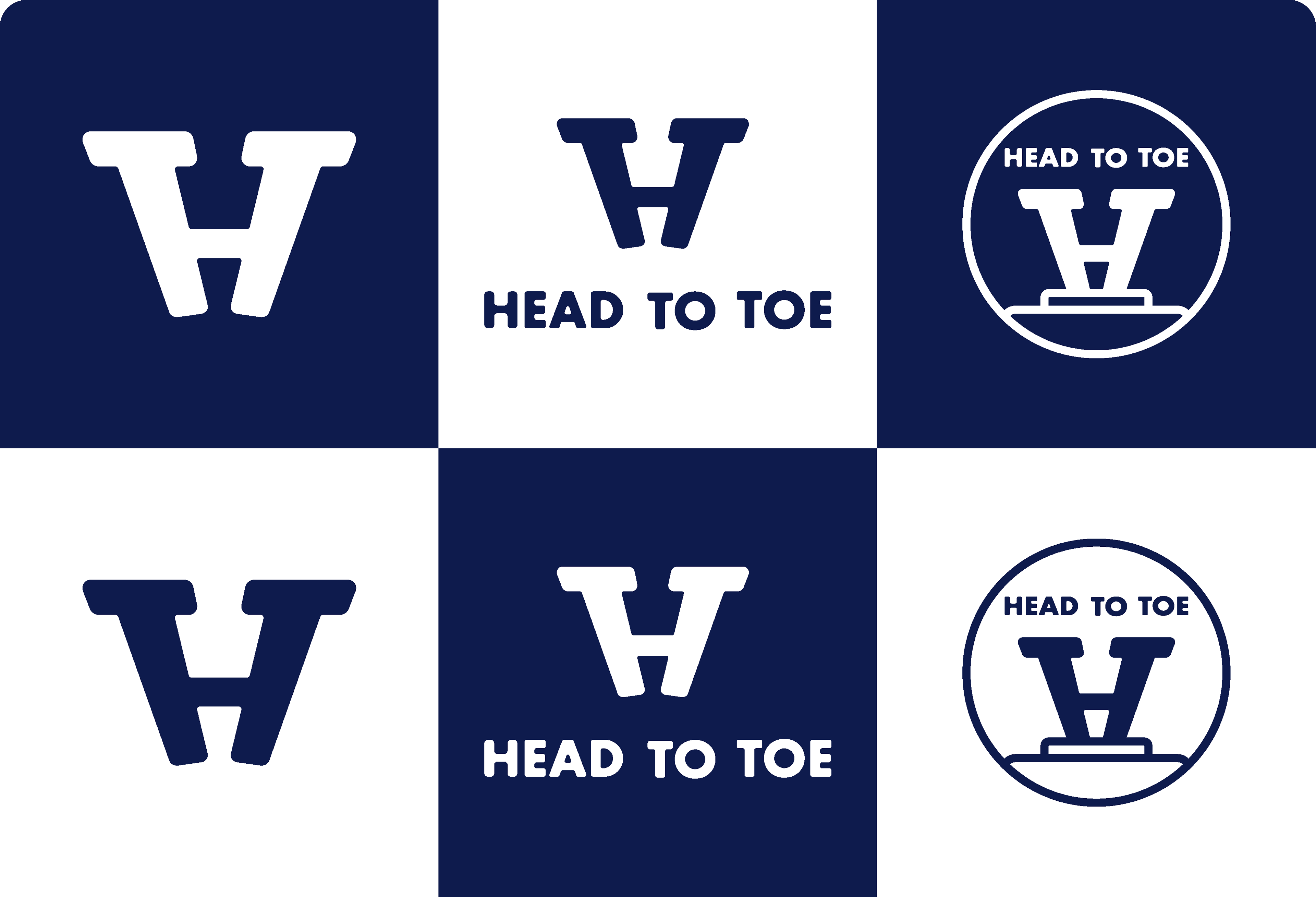
The secondary badge logo incorporates the concept of a podium beneath the primary logo. It also nods to the company's flagships product, the "Metacarp Edge" which was the first unlevel edge grip strength tool introduced to the climbing market.
Unlevel Edge
Head To Toe's signature unlevel edge was introduced as an additional brand element as well as a repeated pattern. After drastically changing the original logo, this acted as a simple nod to the company's roots.