Moontower Inn
Deliverables: Anniversary Logo, Event Signage, Merch Design, Packaging
BRIEF
Moontower Inn is, simply, a very cool place. Including a massive beer wall, impressive variety of exotic wild game hot dogs, high energy live music, and unmistakable heavy metal / grim reaper aesthetic, there's just nothing not to love. Unsurprisingly, they've built a cult following over more than a decade of operating as both a neighborhood bar and creative gathering spot.
For their 14th anniversary, I had the opportunity to participate in their revolving artist series and work with their team to create a merch campaign that nailed their unique vibe.
SOLUTION
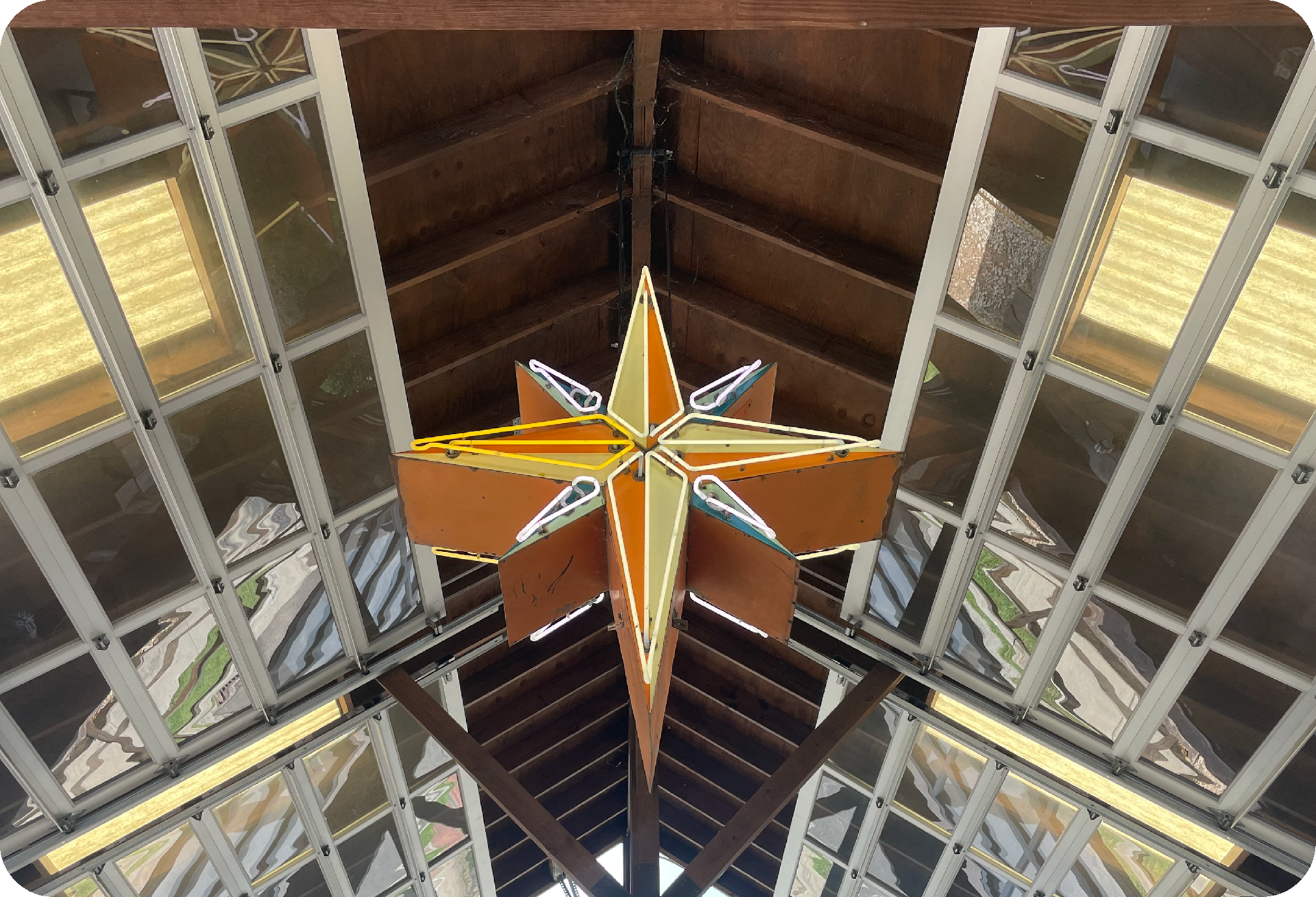
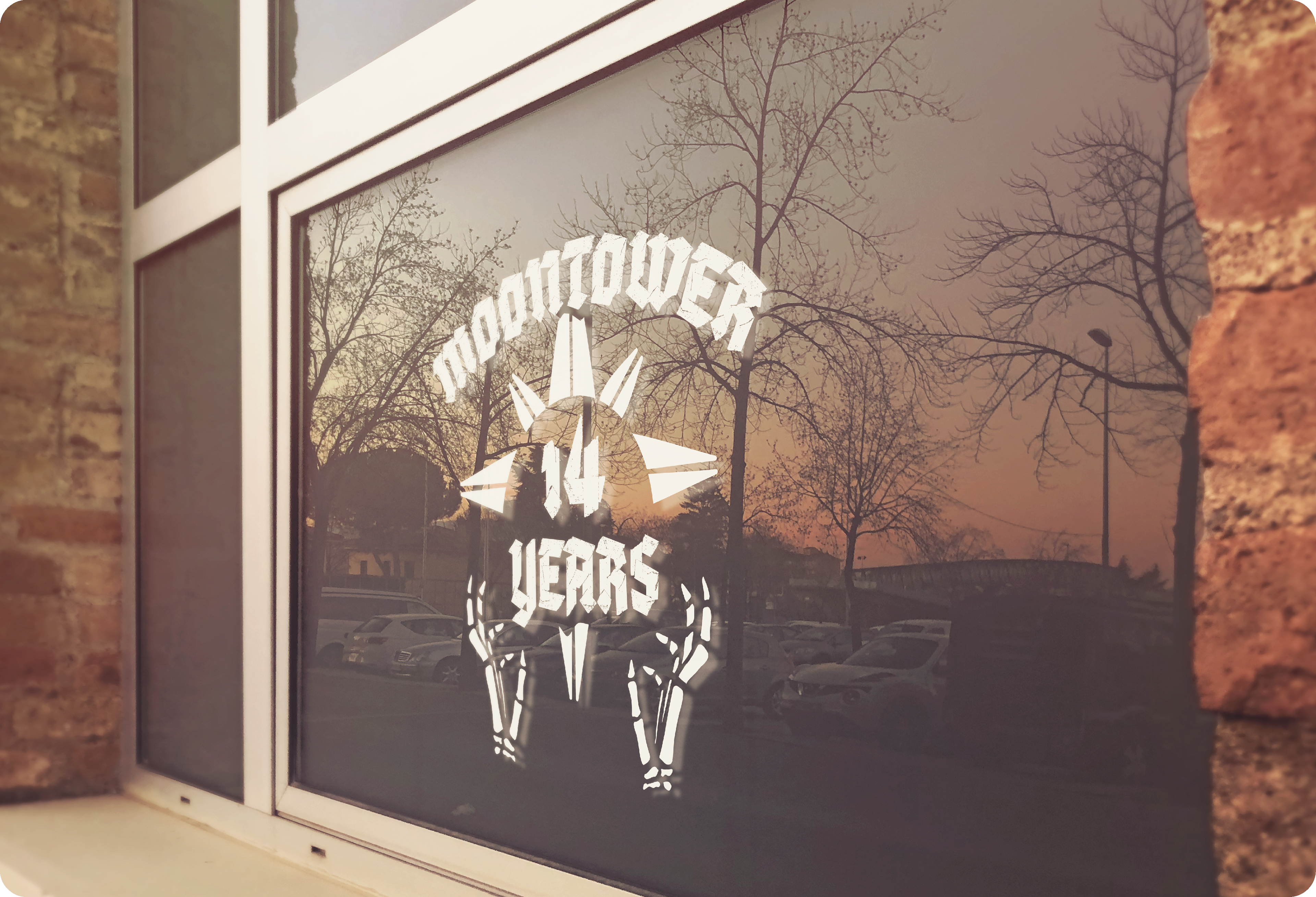
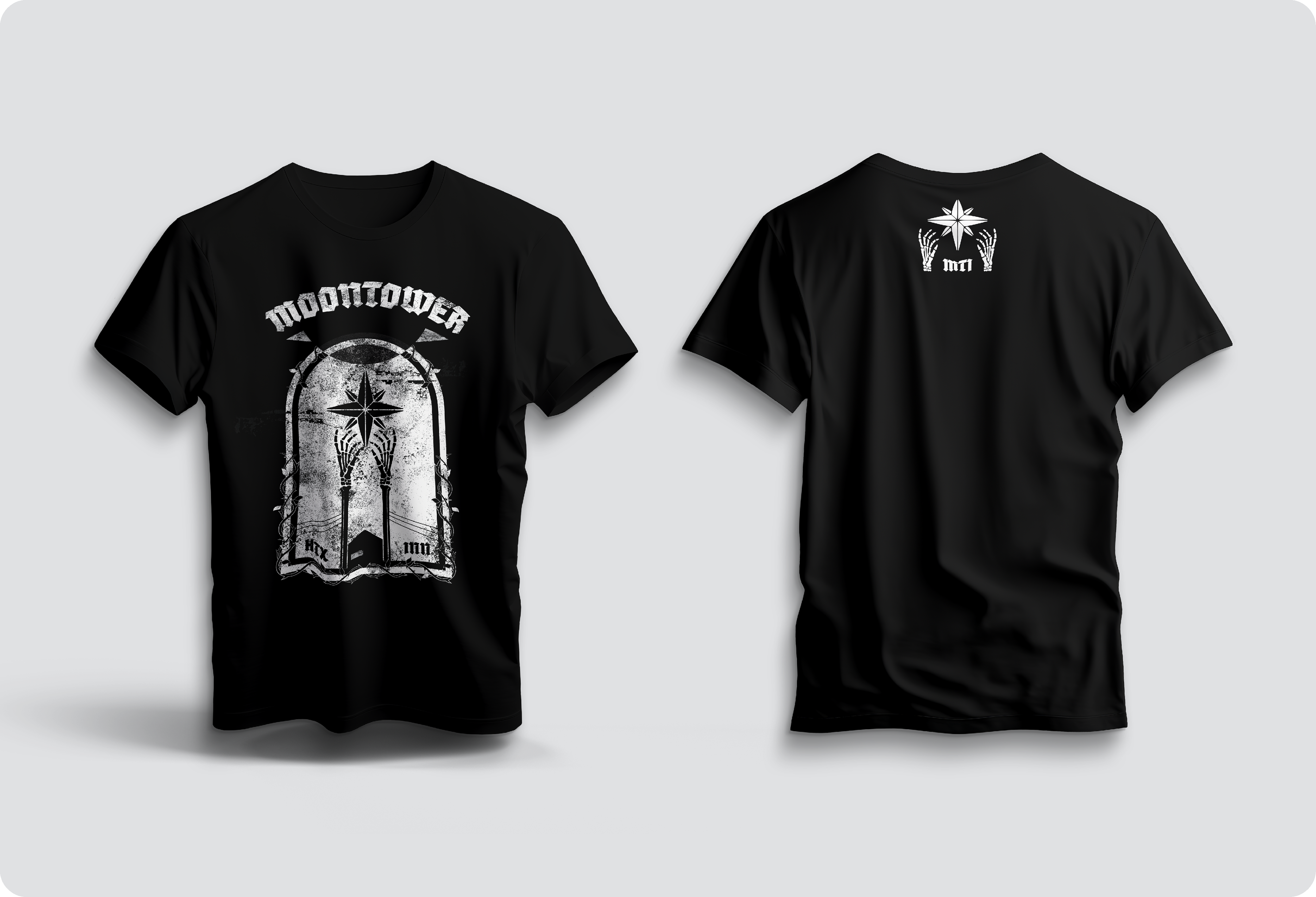
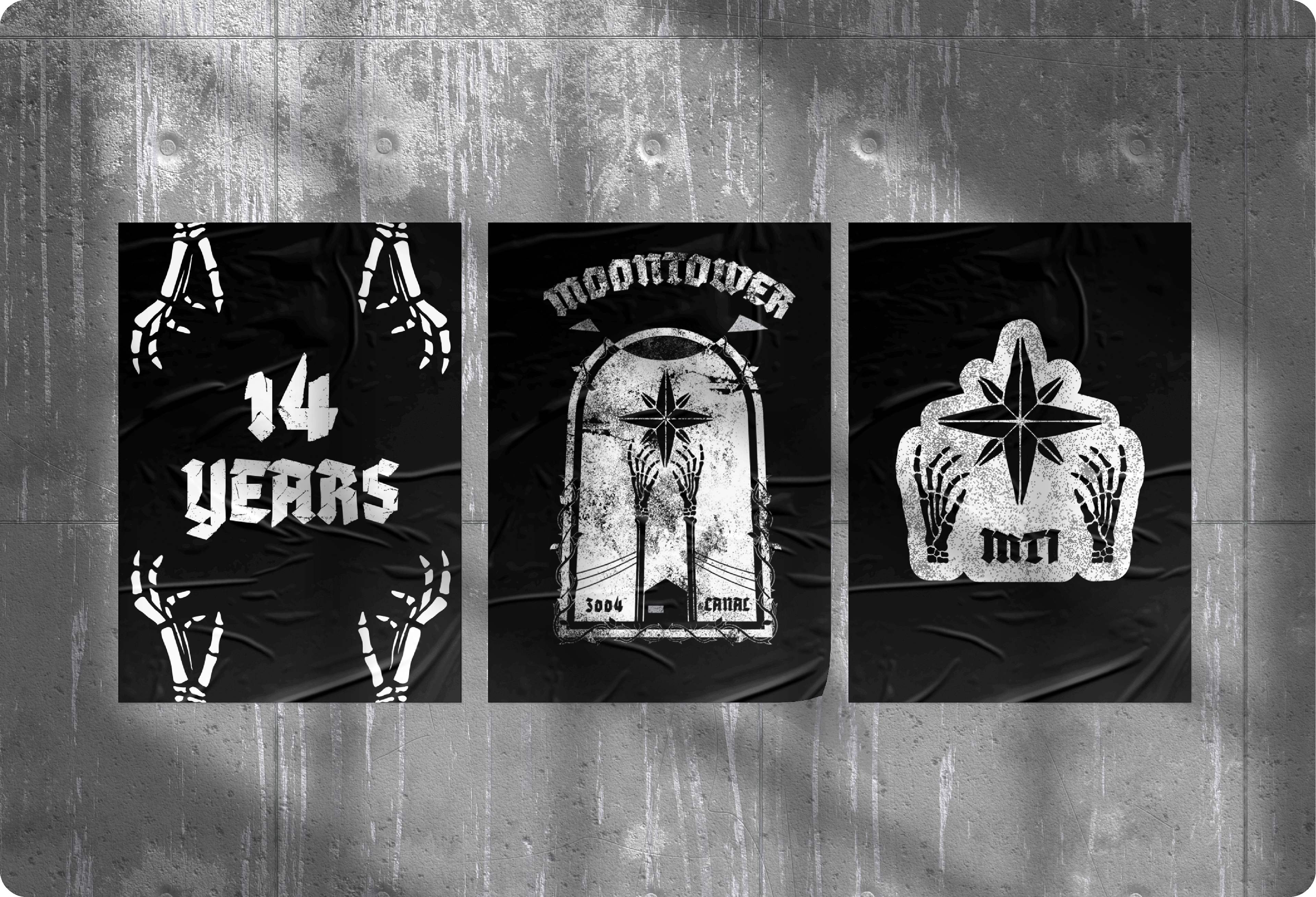
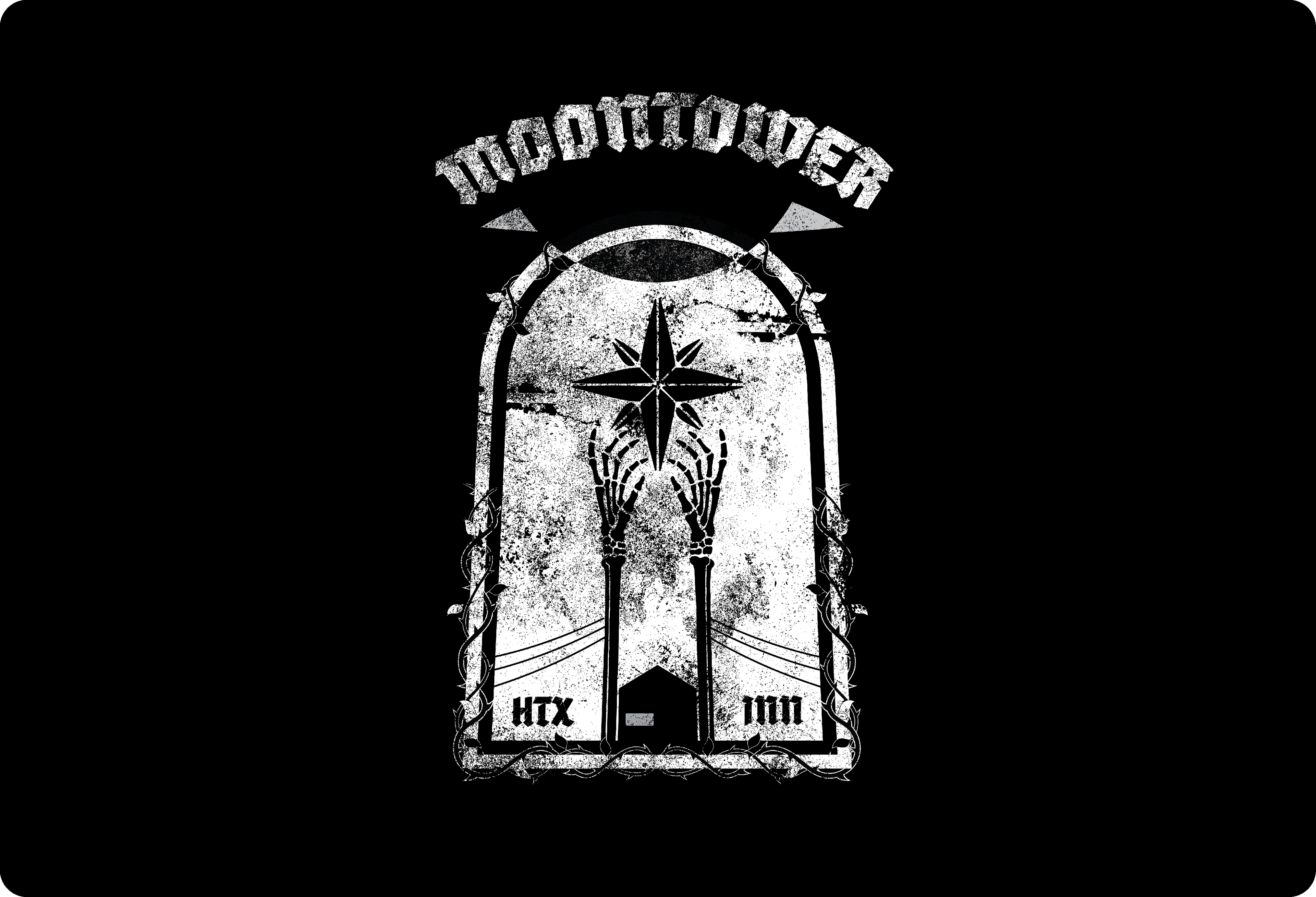
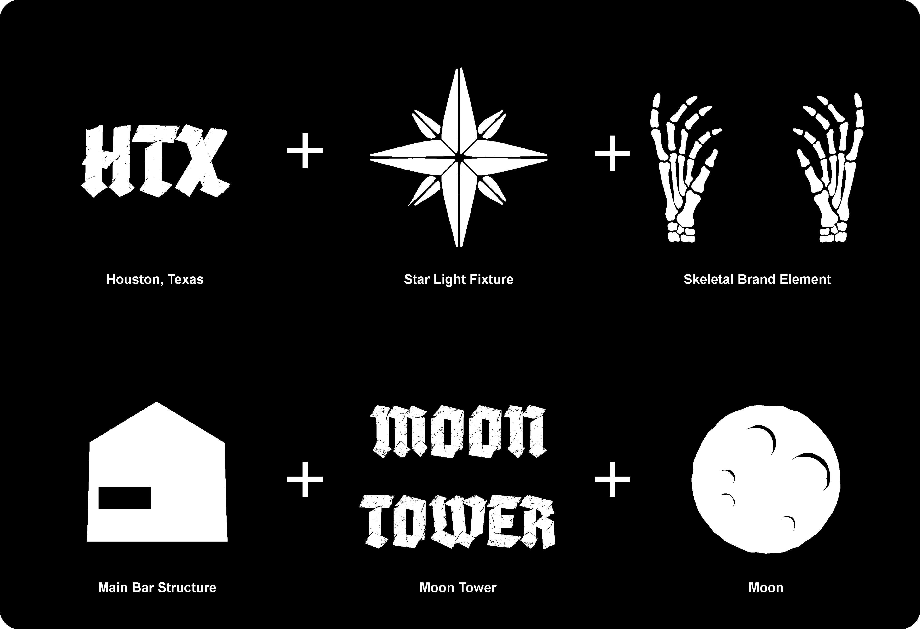
The final design leaned heavily into the bar’s established metal-inspired aesthetic through skeletal hands, gritty black-and-white textures, and bold gothic typography. At the center of the piece is an eight-point star inspired by the massive light fixture hanging inside the bar, while the lower portion of the illustration subtly mirrors the shape of the building itself.
A small open space beneath the “Moontower” wordmark also creates a subtle moon shape — a quiet detail tucked into the composition without overpowering the main graphic.
OUTCOME
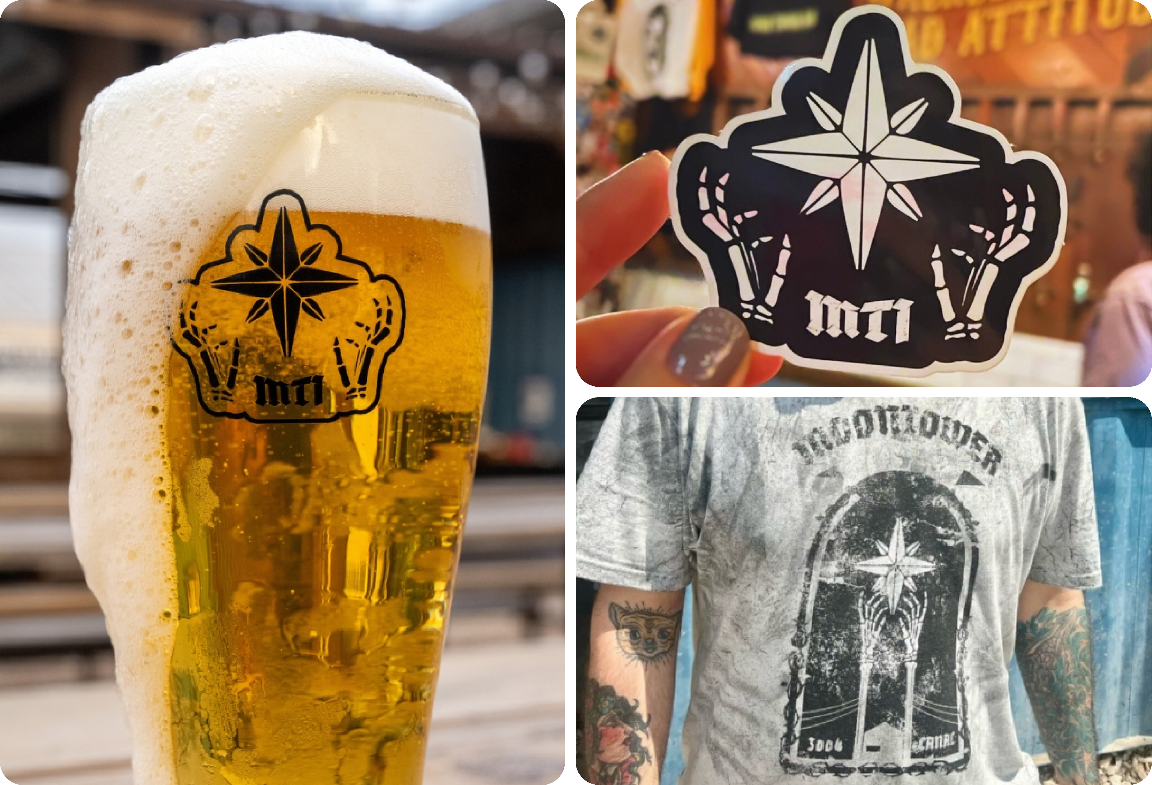
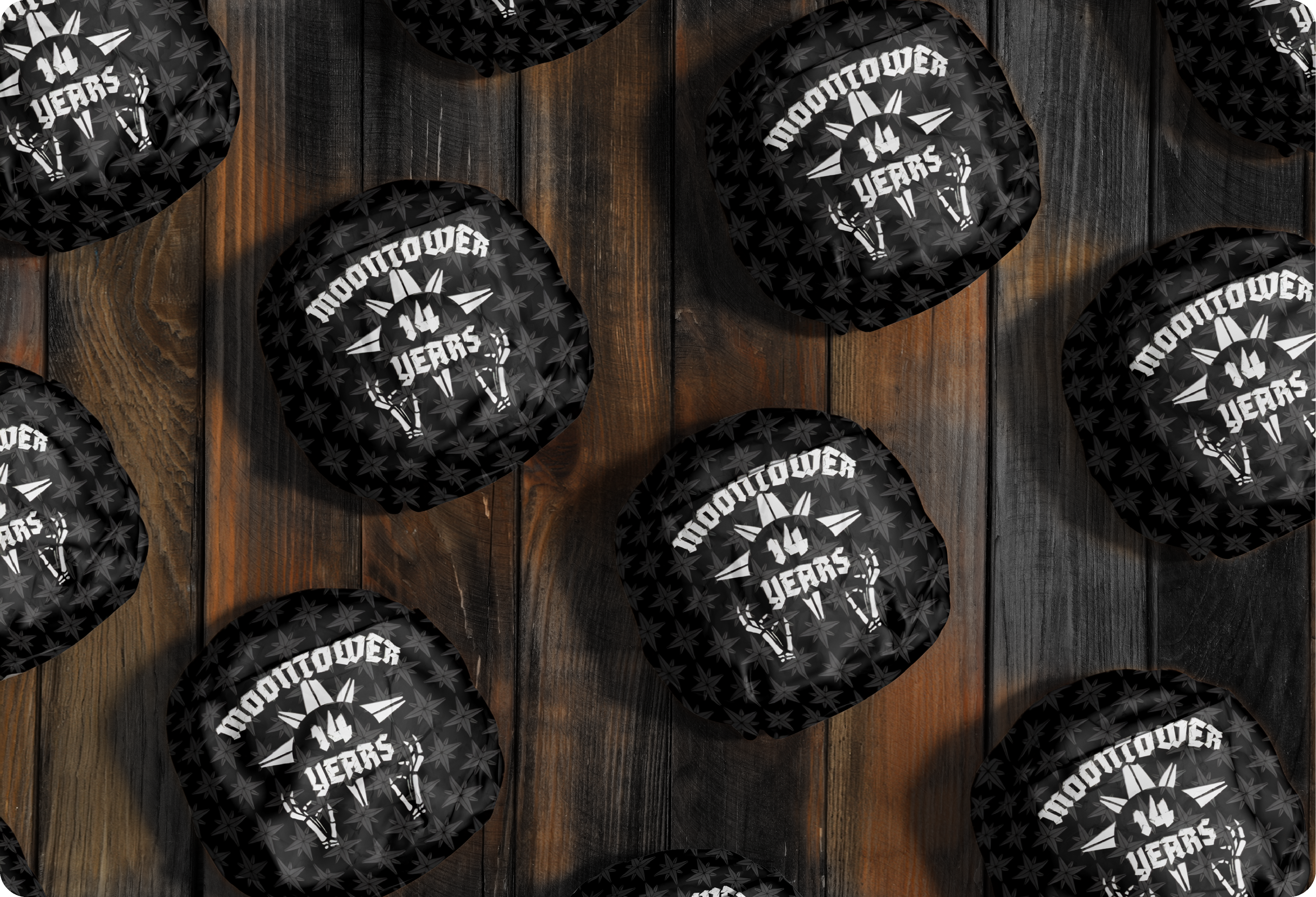
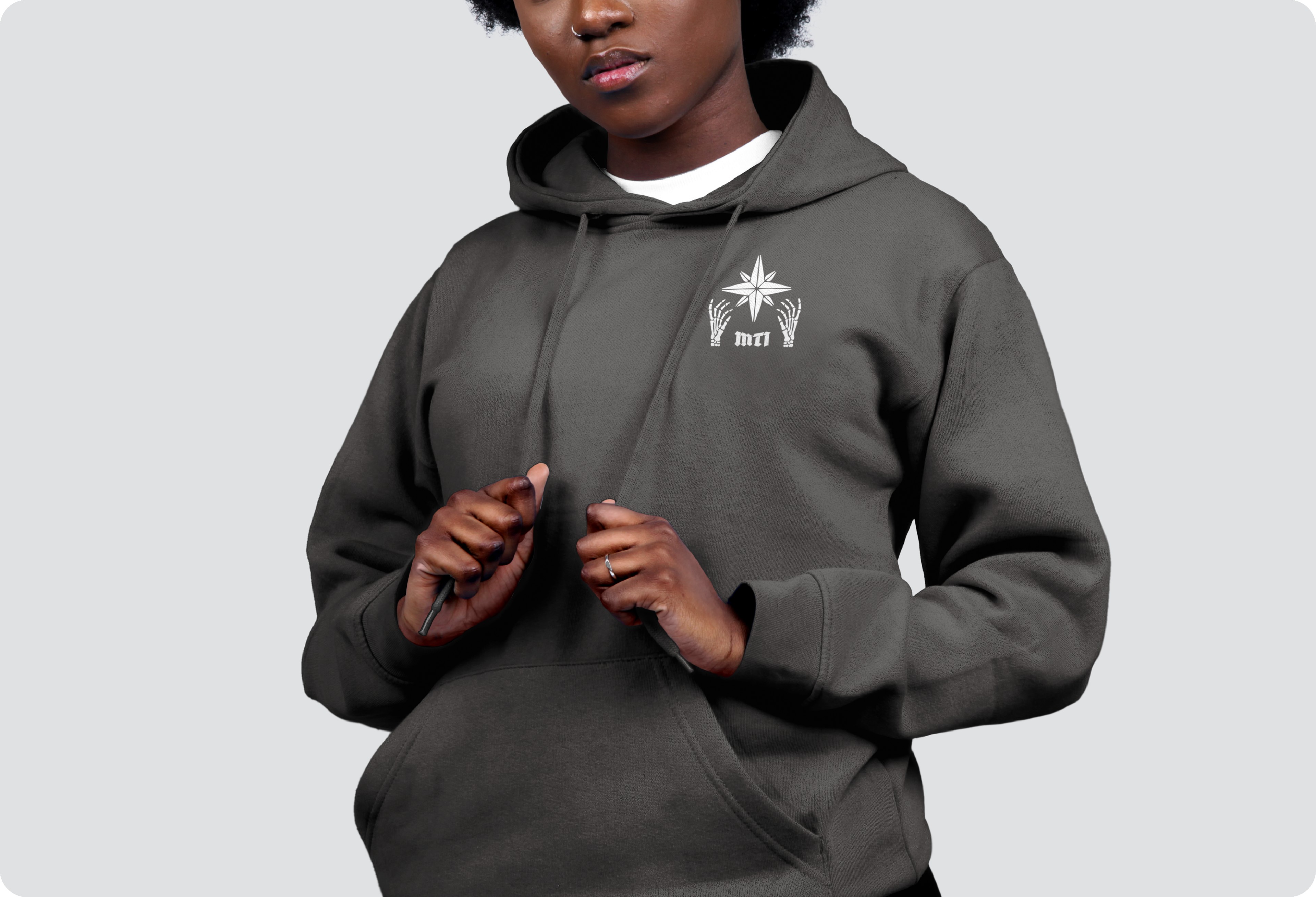
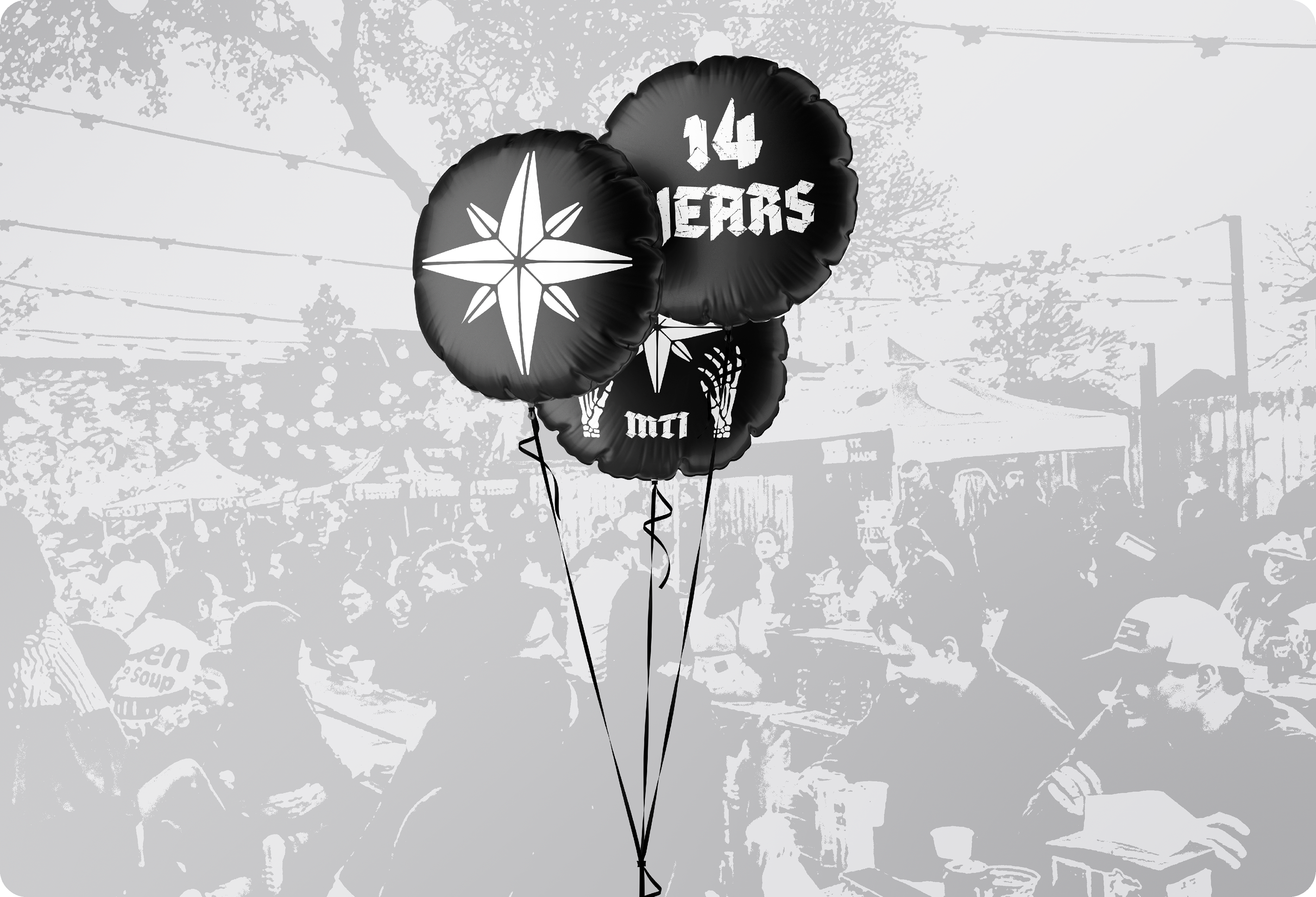
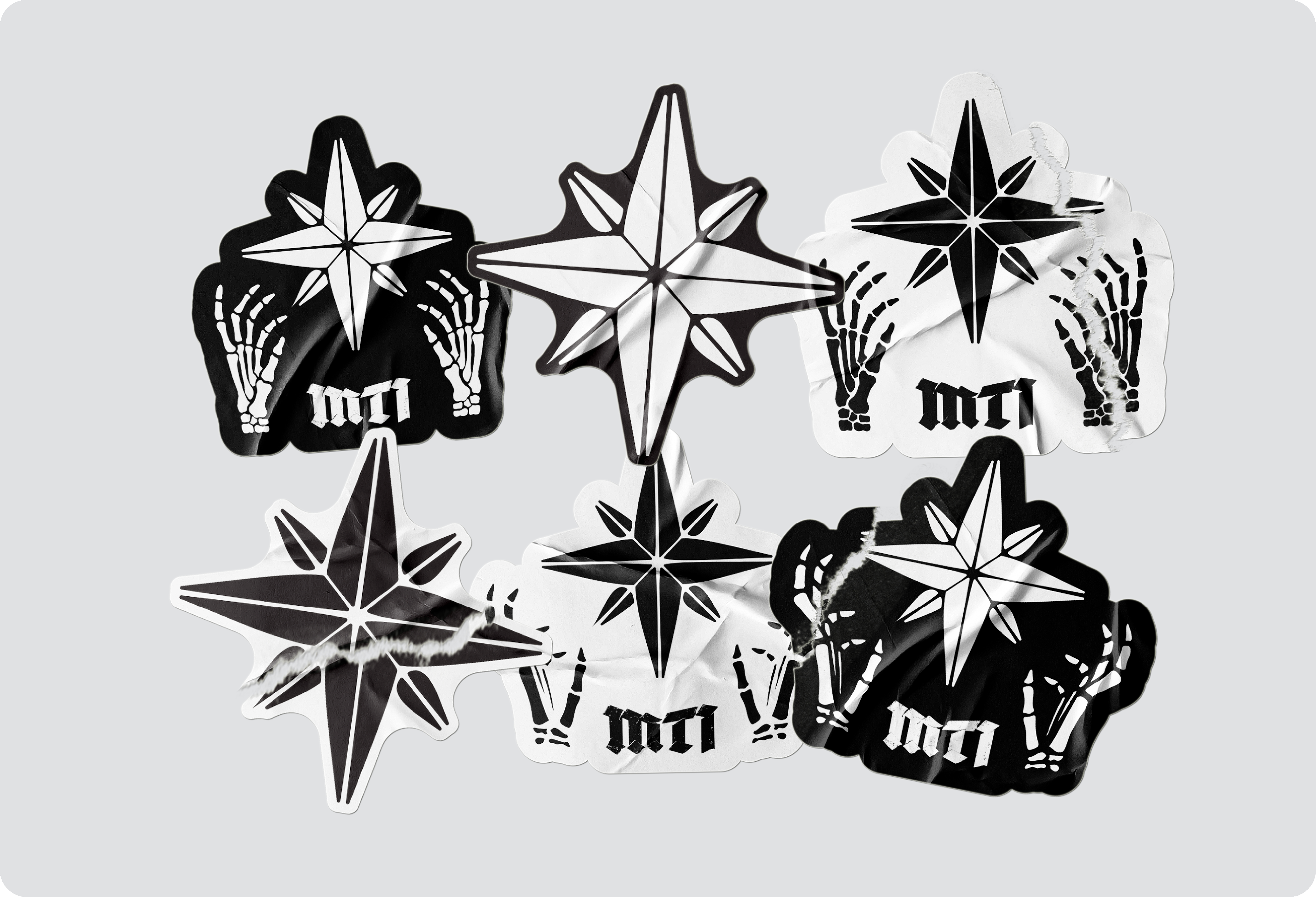
The anniversary artwork was used across customer and staff shirts, stickers, glassware, social media, and other limited merchandise throughout the celebration. The response from both staff and regulars was immediate, and the artwork quickly became a key element of the anniversary event.
The Star
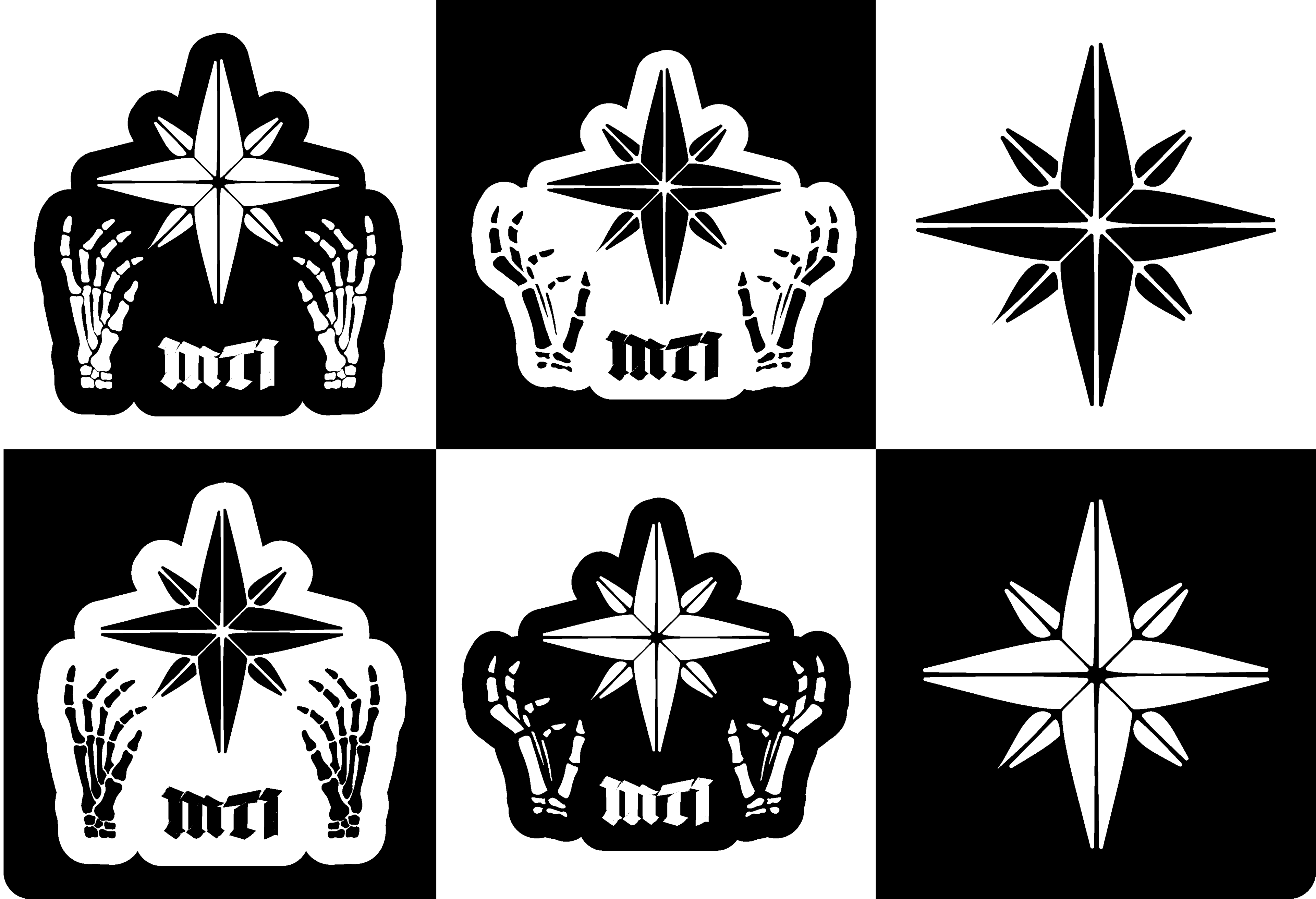
Moontower's interior space is defined by a large 8-pointed star that hangs above the bar. The design direction we chose ultimately centered around combining this feature with the more established skeletal / metal / gritty brand elements.