Equation Events
Deliverables: Brand Development, Marketing Management, Creative Direction
Deliverables: Brand Development, Marketing Management, Creative Direction
THE CLIENT
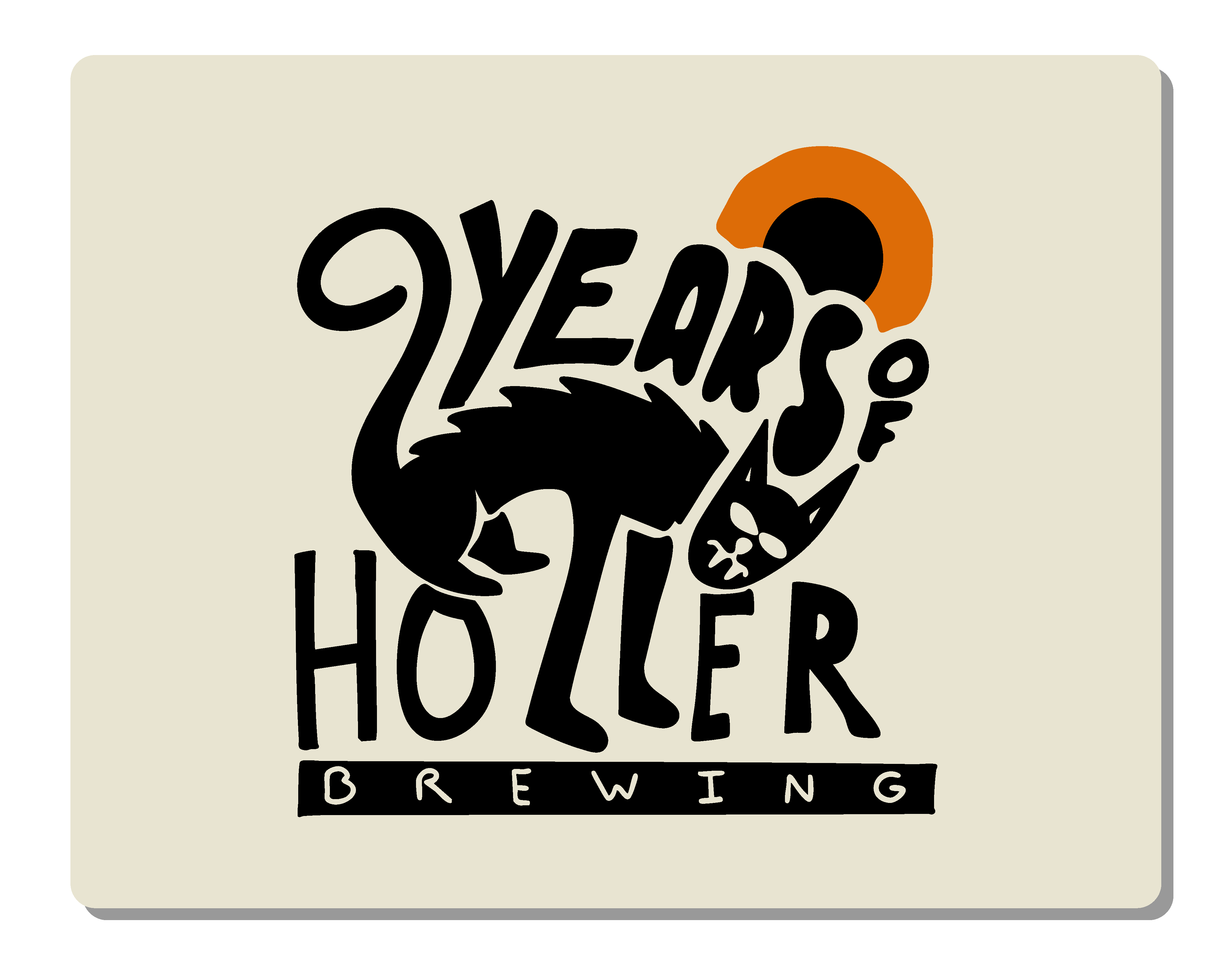
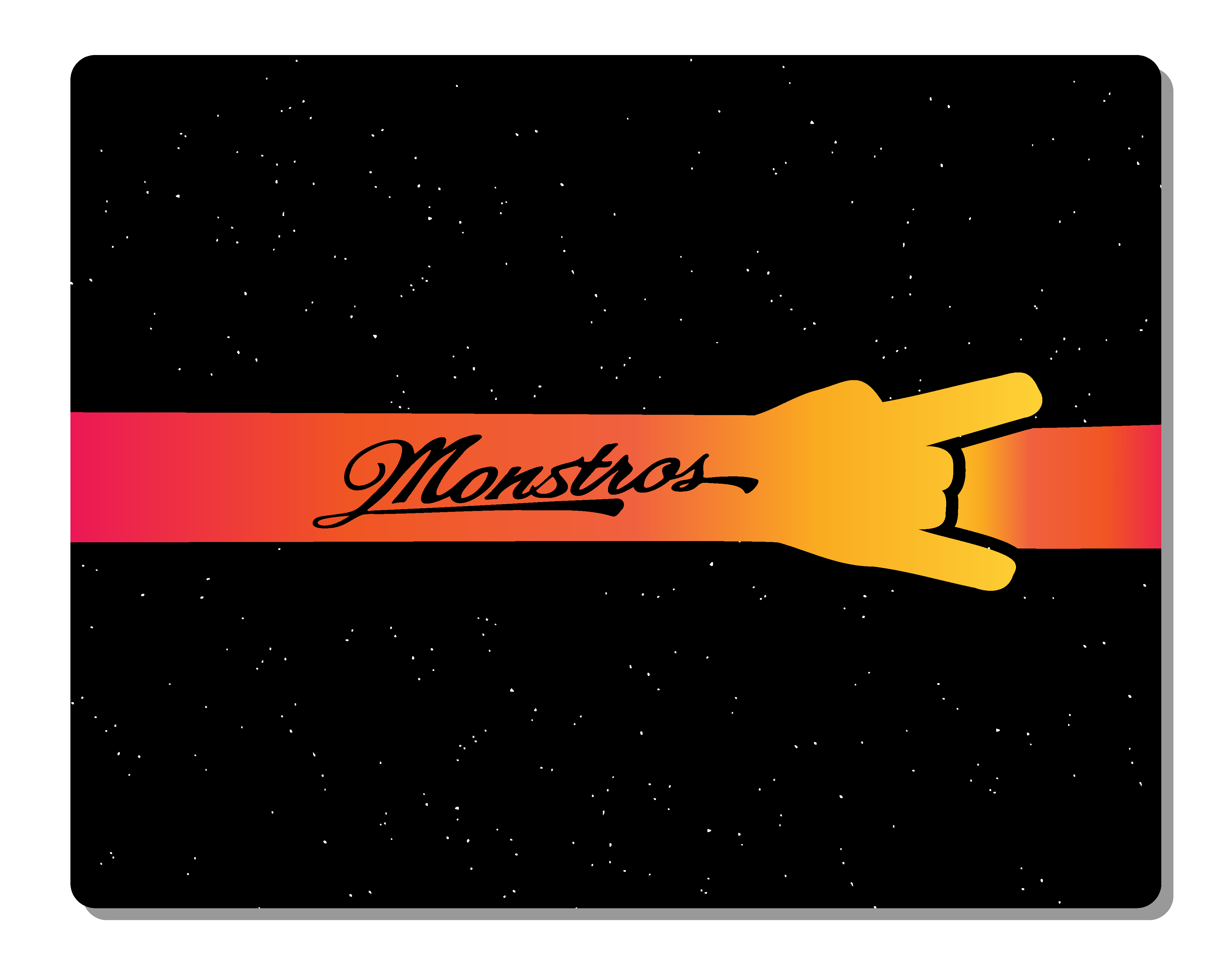
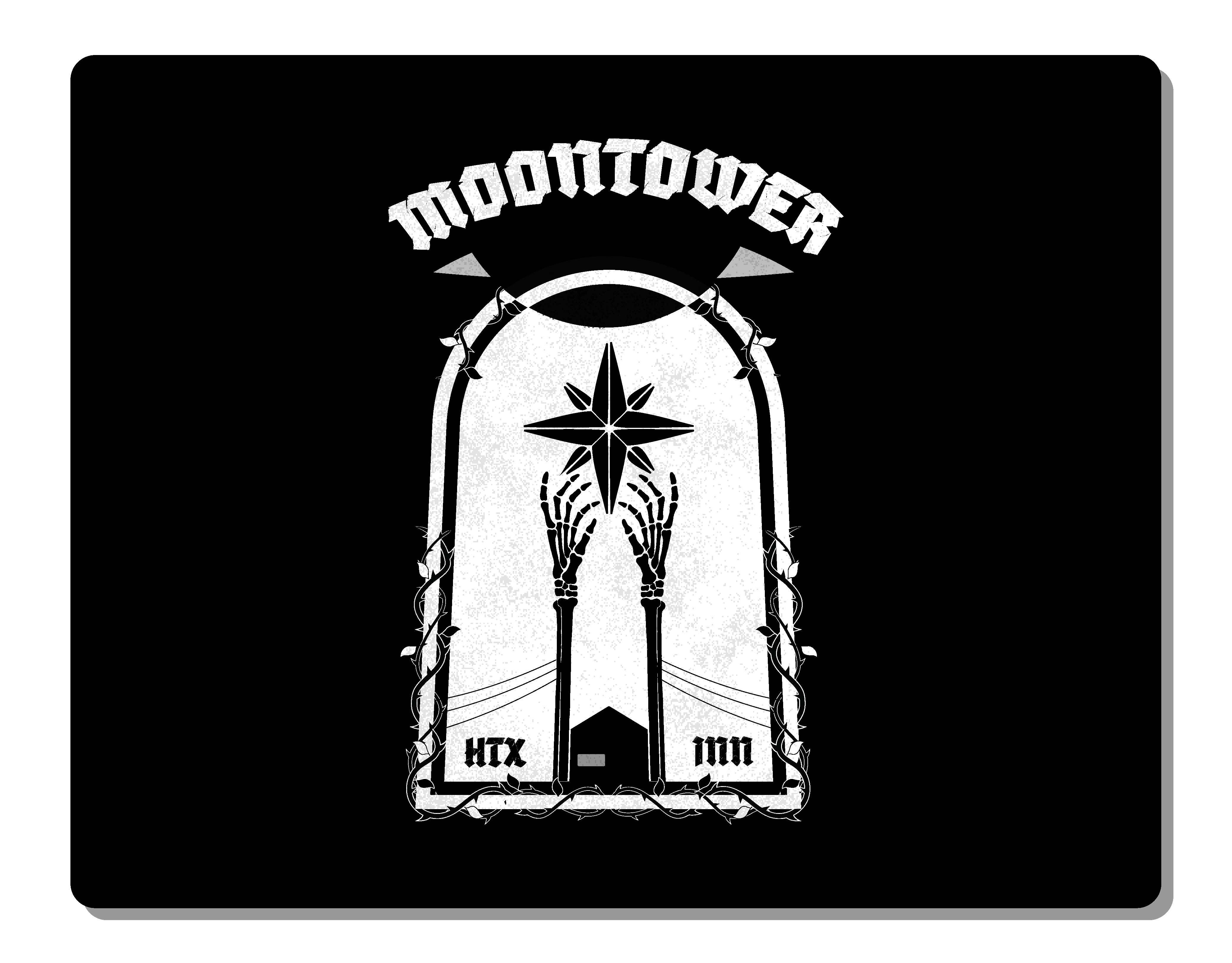
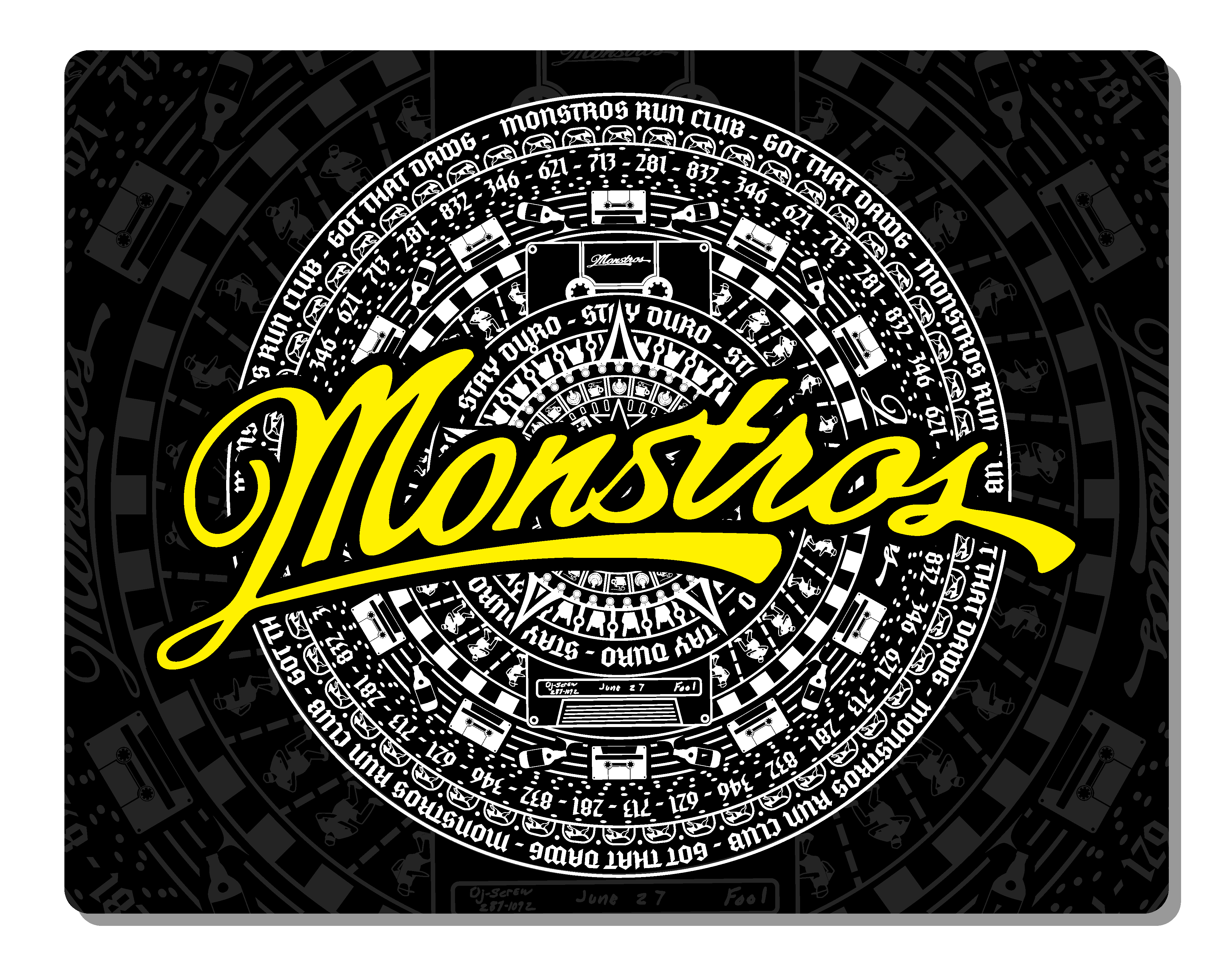
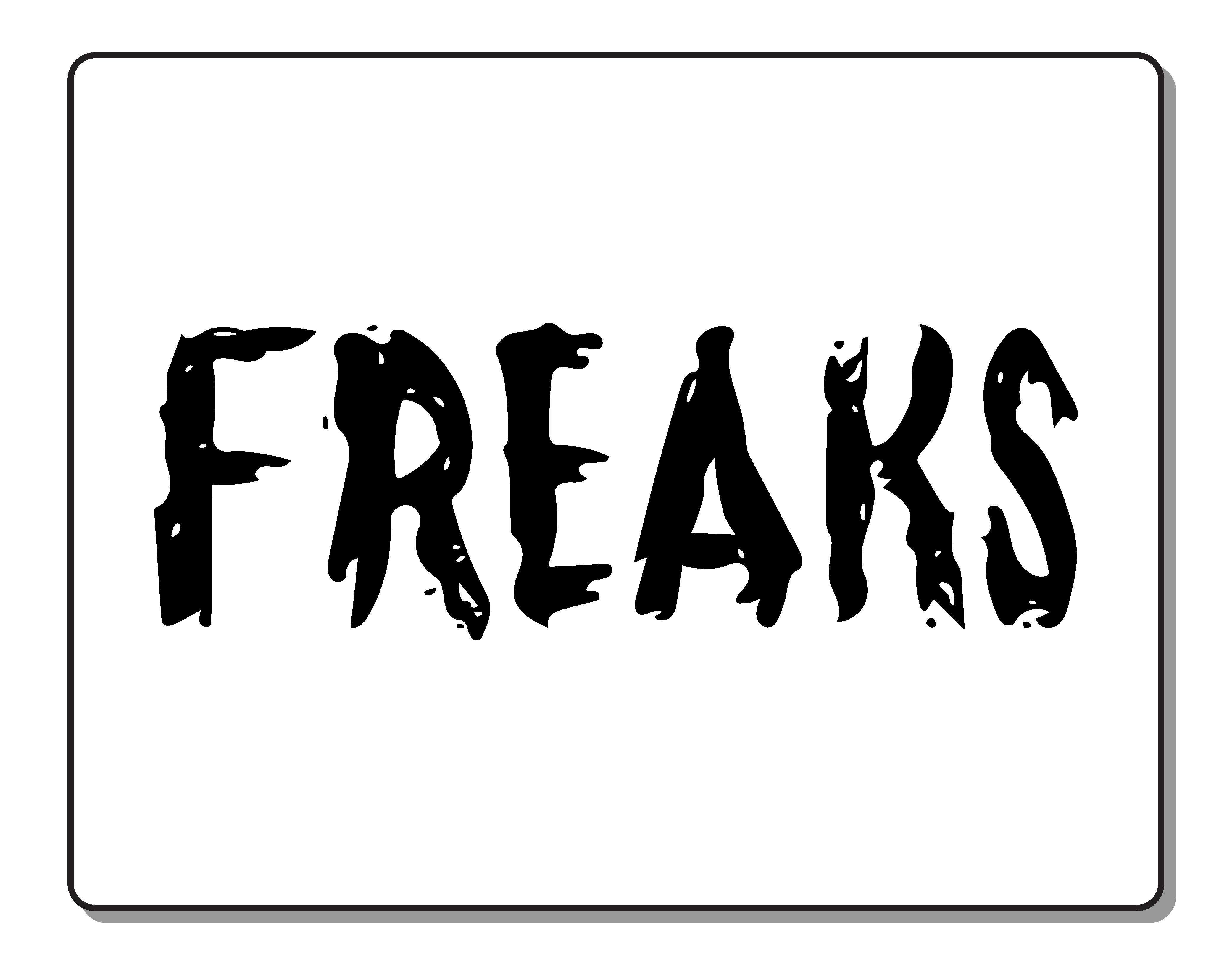
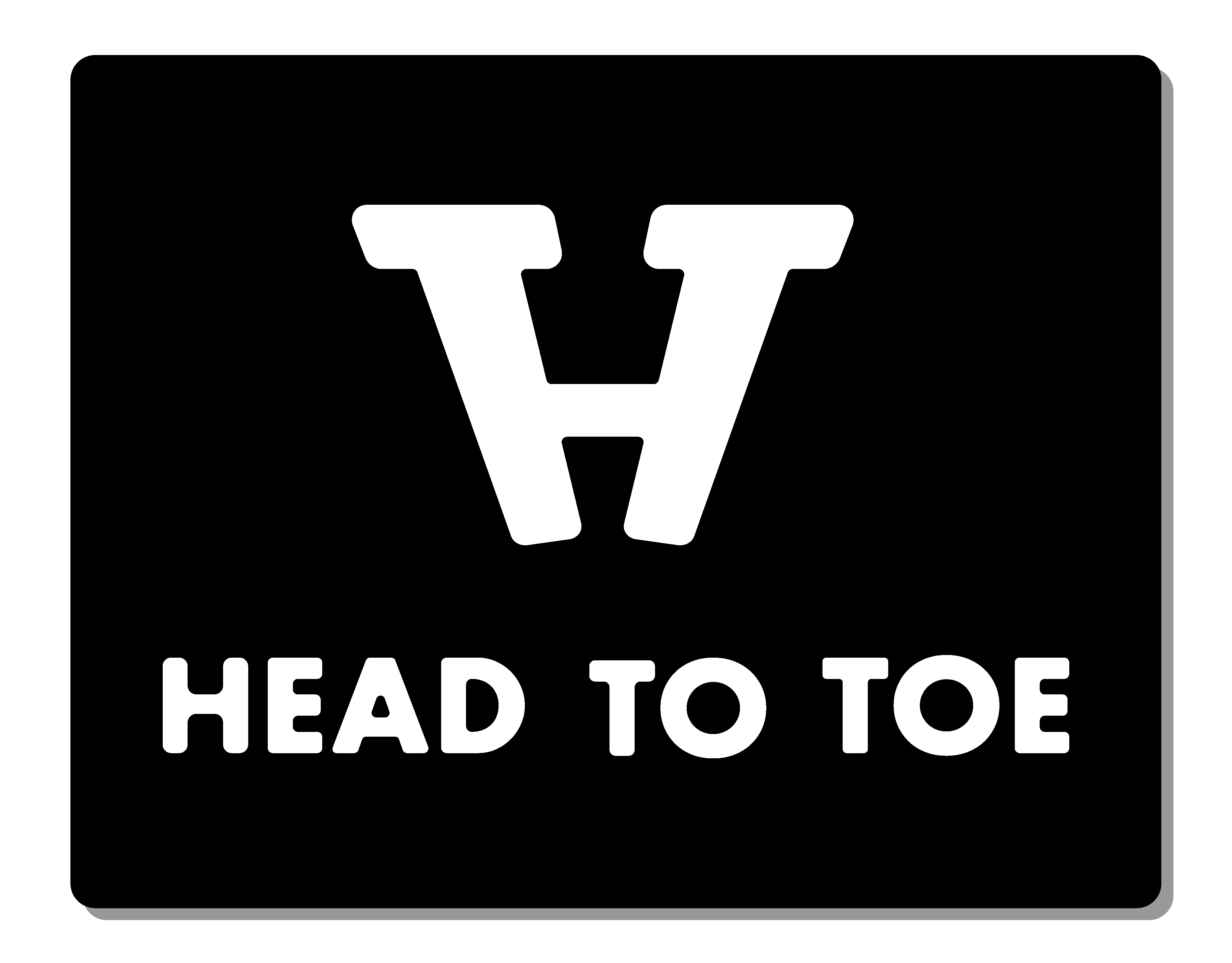
Equation Events is a central hub for unique event services aimed at a corporate audience. Specializing in trade shows, conferences, corporate parties, and team-building events, they have a huge range of offerings that help clients hit their event goals. During my time as Marketing Director with the company, one challenge we faced was creating a consistent brand presence while operating multiple visually distinct properties.
Equation grew from an initial collection of flagship services, and the identity of those properties needed to stay intact. At the same time, new services created under the Equation umbrella needed to operate within the same, cohesive brand identity.
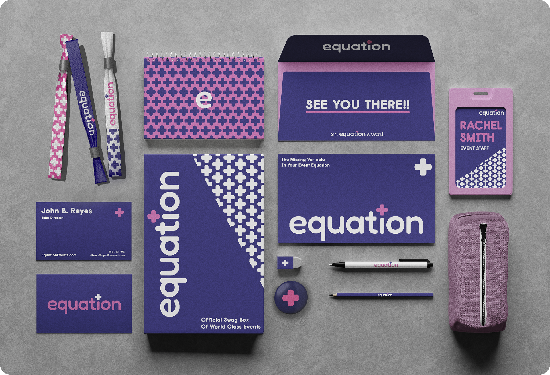
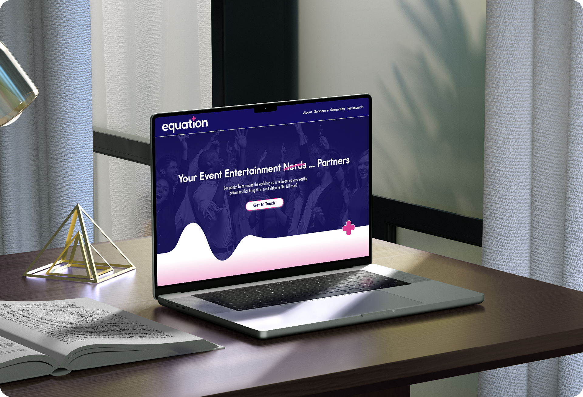
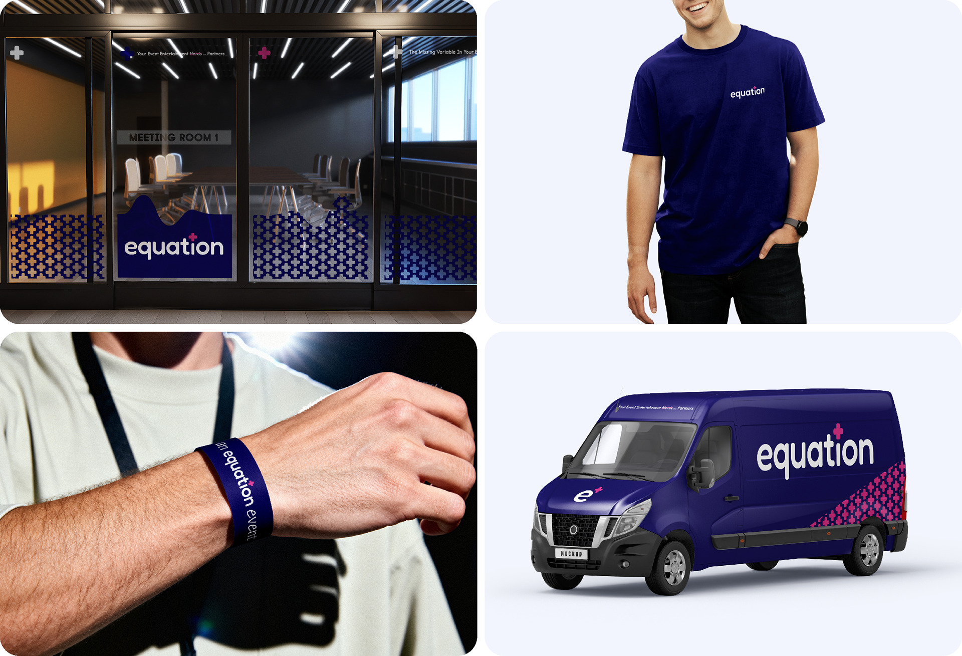
To achieve this, the Equation wordmark was incorporated into a flexible framework that allowed continuity between properties while still allowing them to display their own distinct identity.
Brand Flexibility
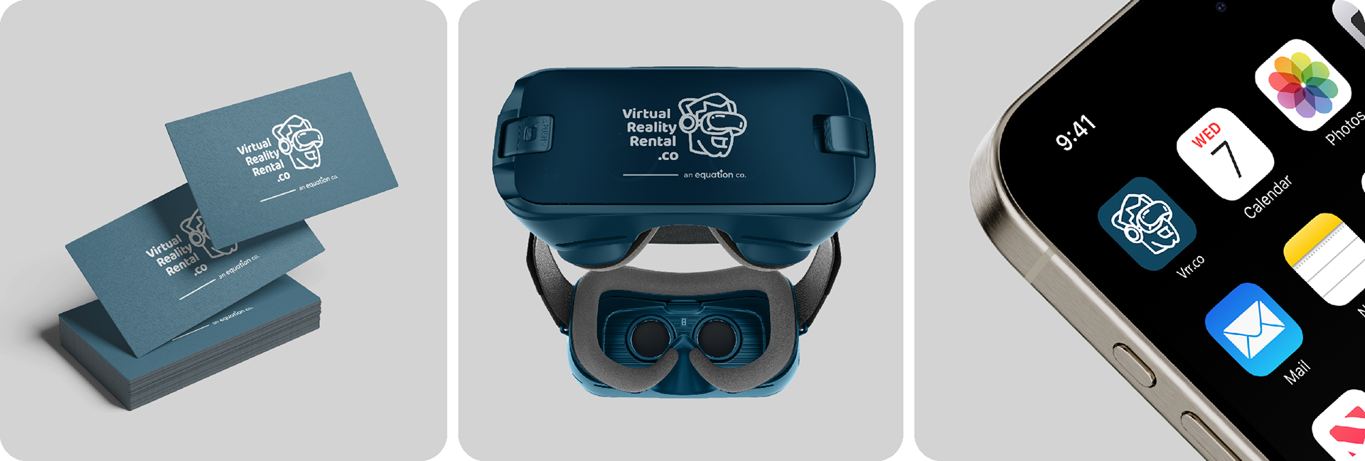
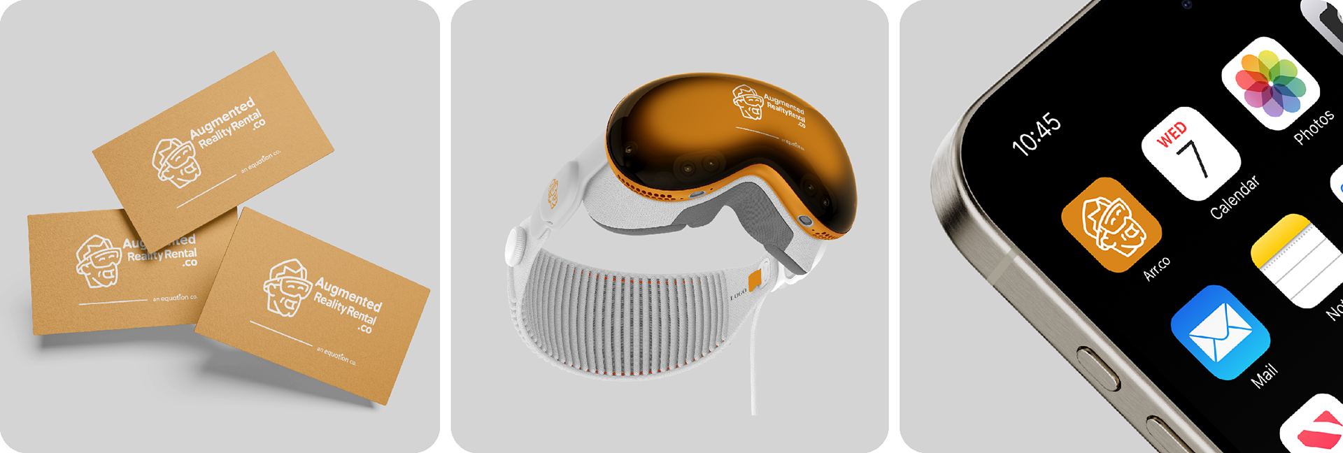
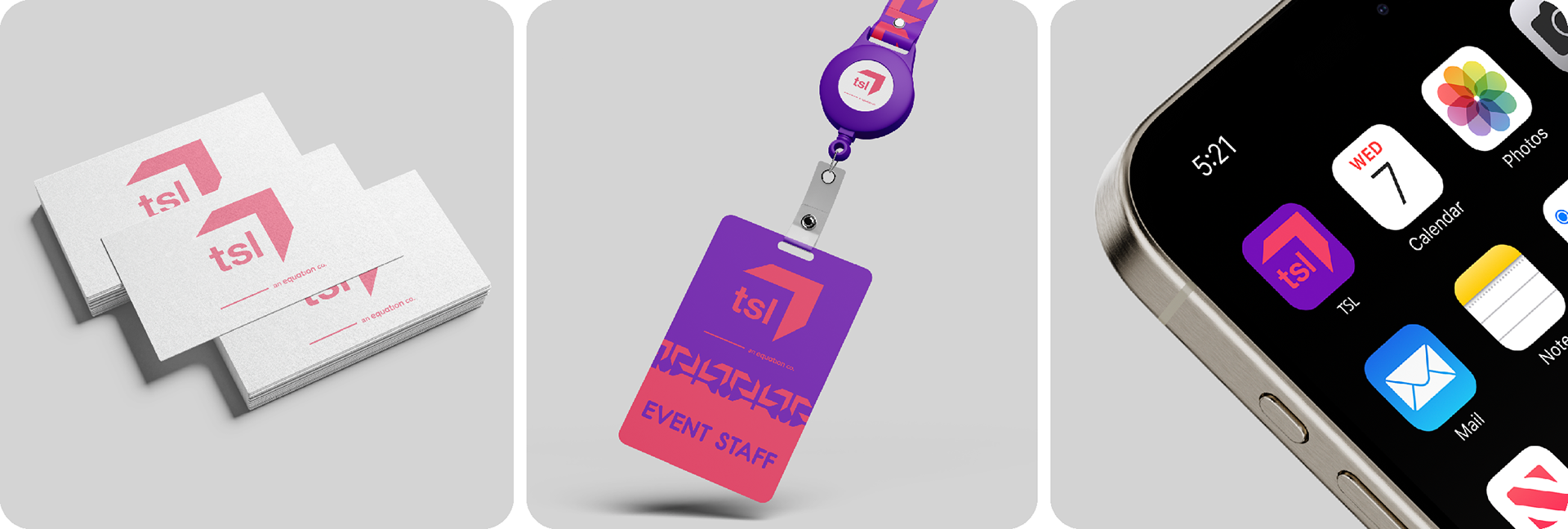
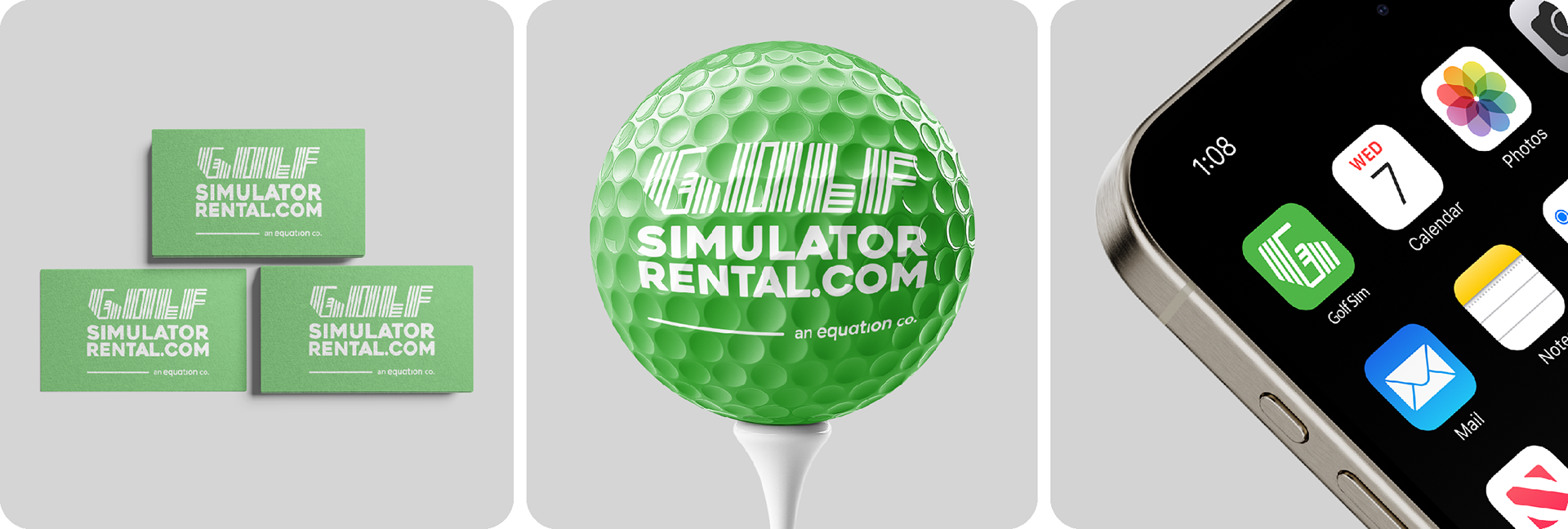
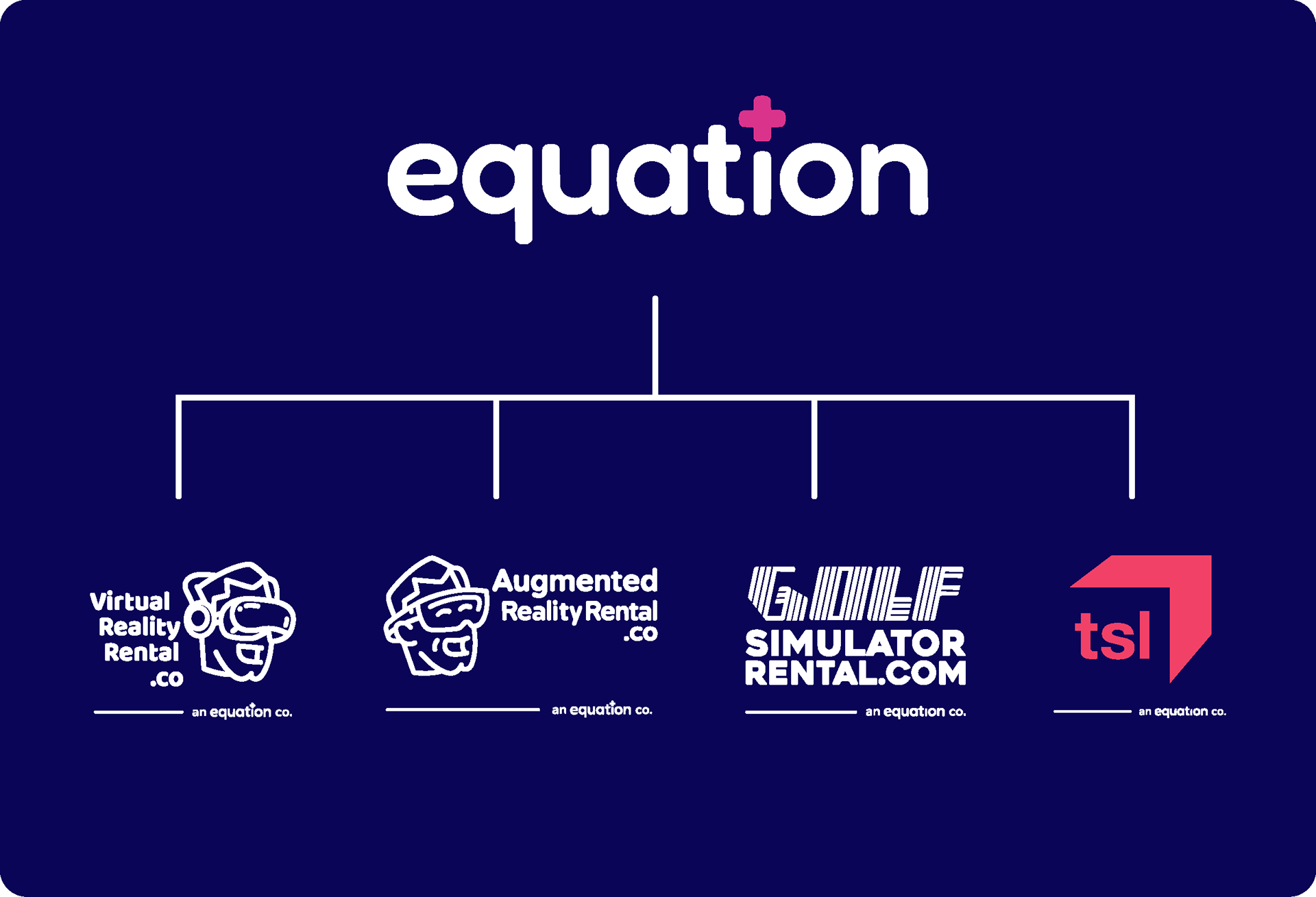
Using the central Equation wordmark, a simple system was designed using a horizontal line allowing the mark to fill the width of the logos of individual properties. While each sub-brand has the flexibility to use its own identity without Equation branding, this approach allows for a more cohesive identity where appropriate.
Individual Properties
Within Equation's portfolio, each distinct service offering includes the core "Equation" identifier.