Freaks Come Out At Night RunClub
Deliverables: Visual Identity, Singlet Design, Custom Typography, Merch Design
BRIEF
Freaks Come Out At Night Run Club was created as a way for people to stay active, explore Houston, and make genuine connections through running. Unlike most clubs who host every run from the same weekly location, the club moves throughout the city introducing runners to new neighborhoods, supporting local businesses, and making the club accessible to people all over Houston's massive footprint.
Community is at the center of everything Freaks does, so when they approached me to design their first truly custom racing singlet, the goal was clear: create something that reflected the people who make the club special.
SOLUTION
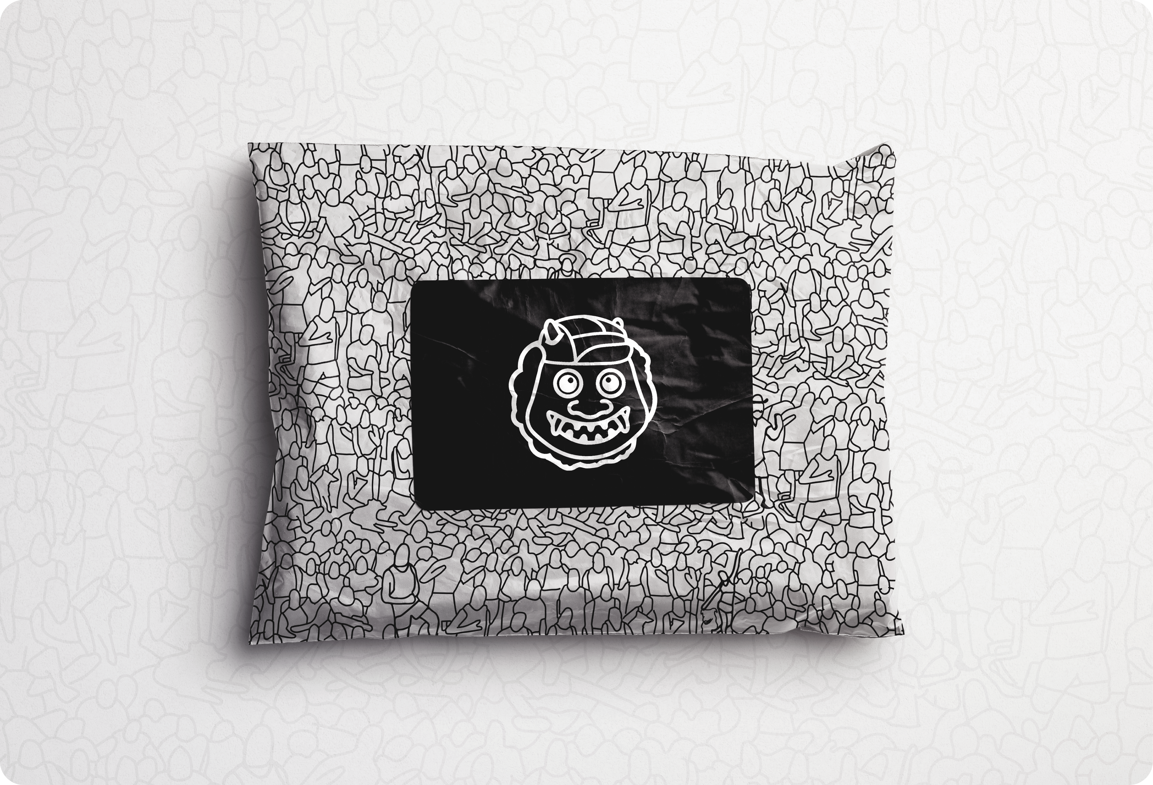
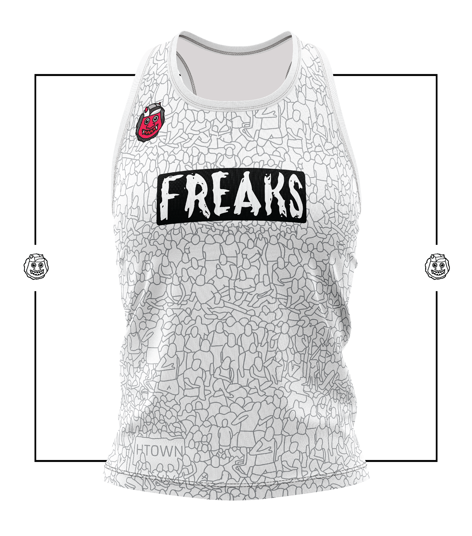
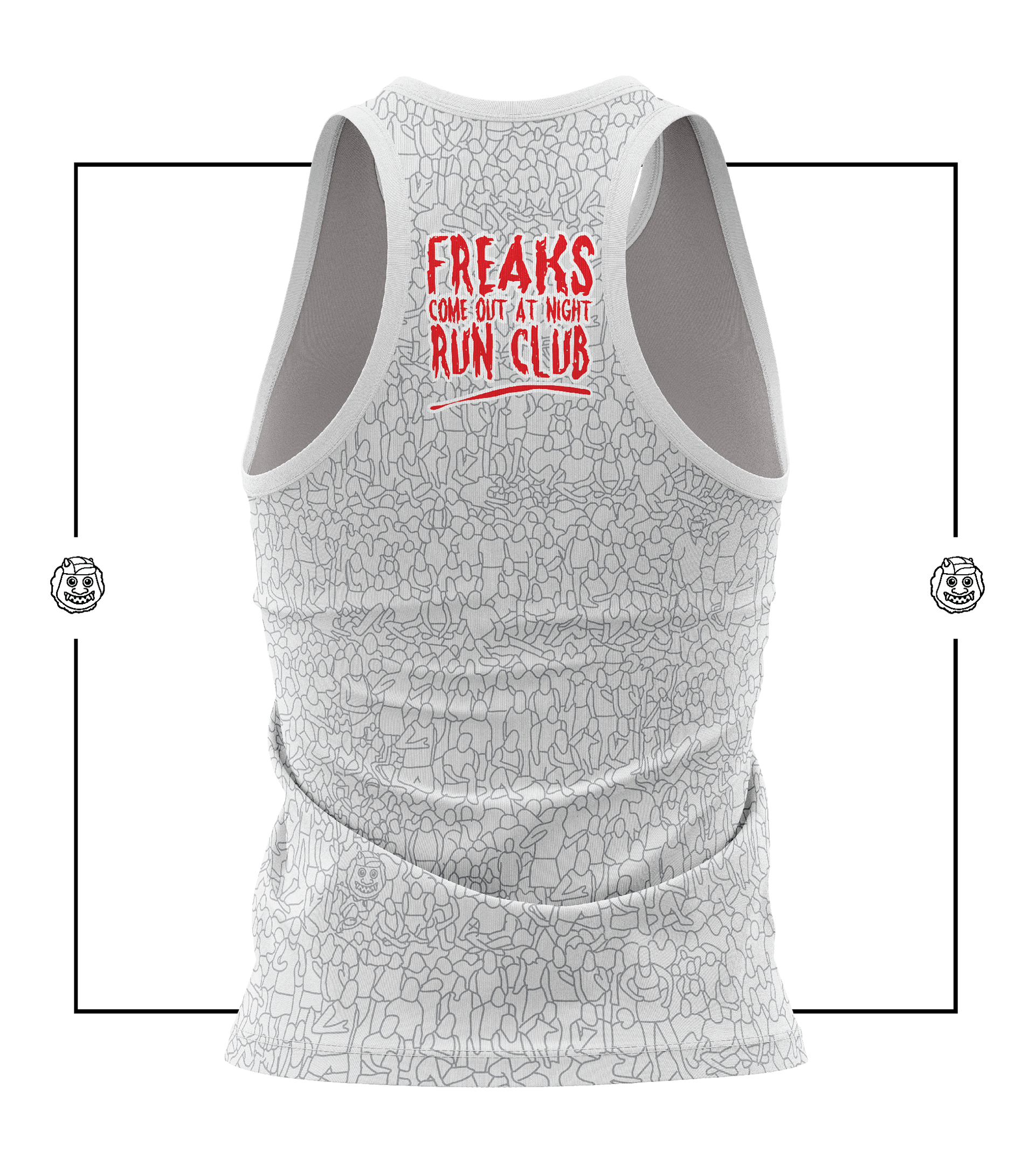
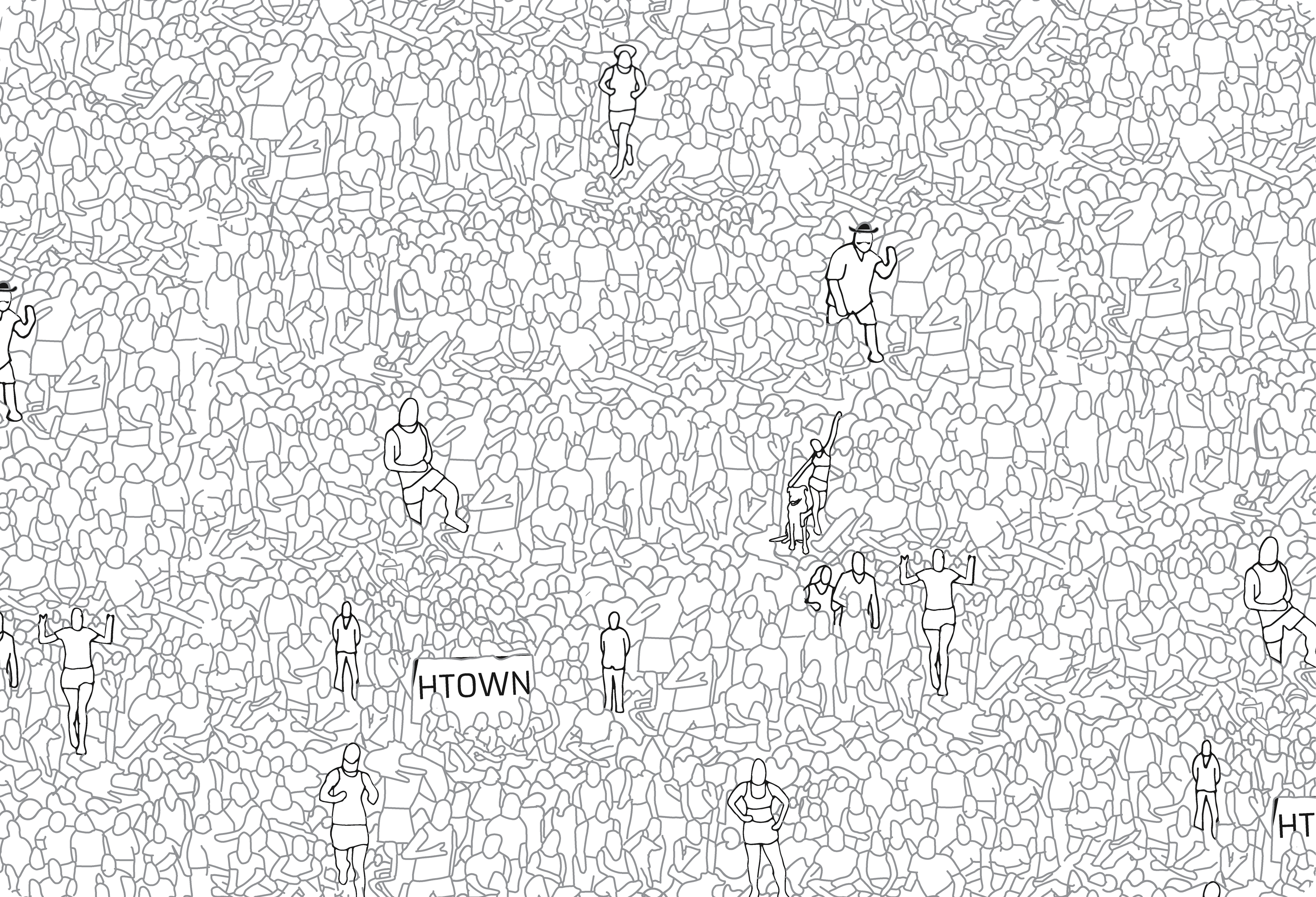
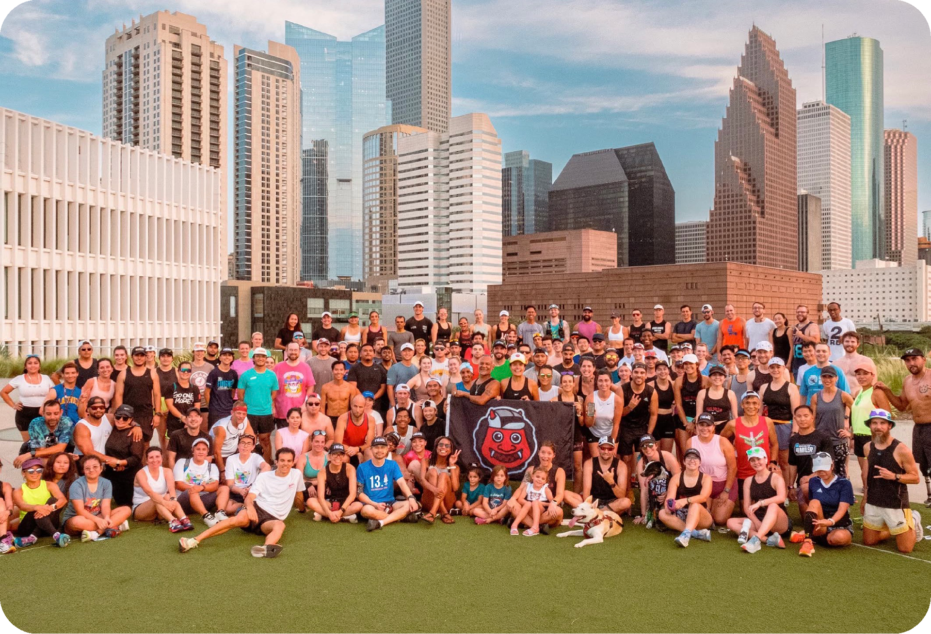
The focal point of the design became Freaks’ yearly group photo; a tradition where as many members as possible gather together for one massive picture. After exploring initial concepts of turning the crowd into a frame for the club name, we landed on hand-drawn outlines of people within the photo which were then turned into an organic, non-symmetrical repeating pattern.
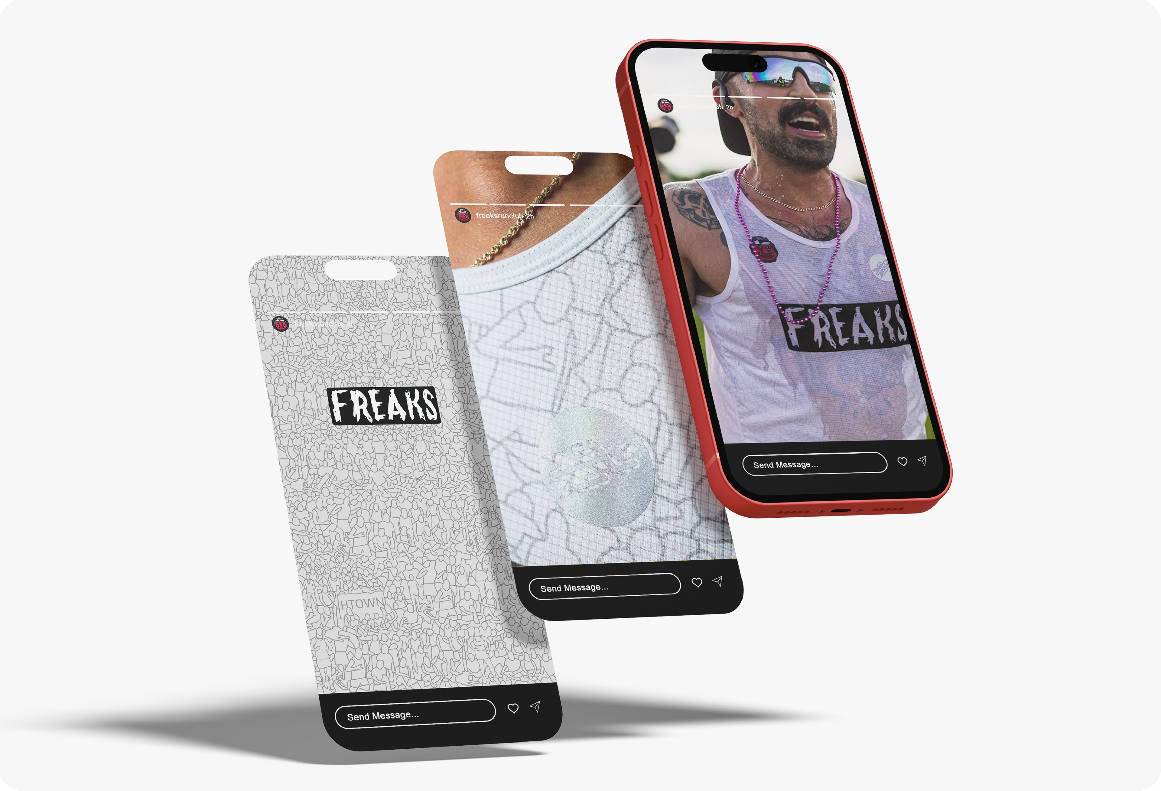
The final design gave the singlet a much more unique feel. Instead of centering performance, medals, or race results, it centered the community itself by turning actual club members into the visual identity of the piece. Hidden illustrations of Freaks board members were also worked throughout the pattern as small easter eggs for members to discover.
OUTCOME
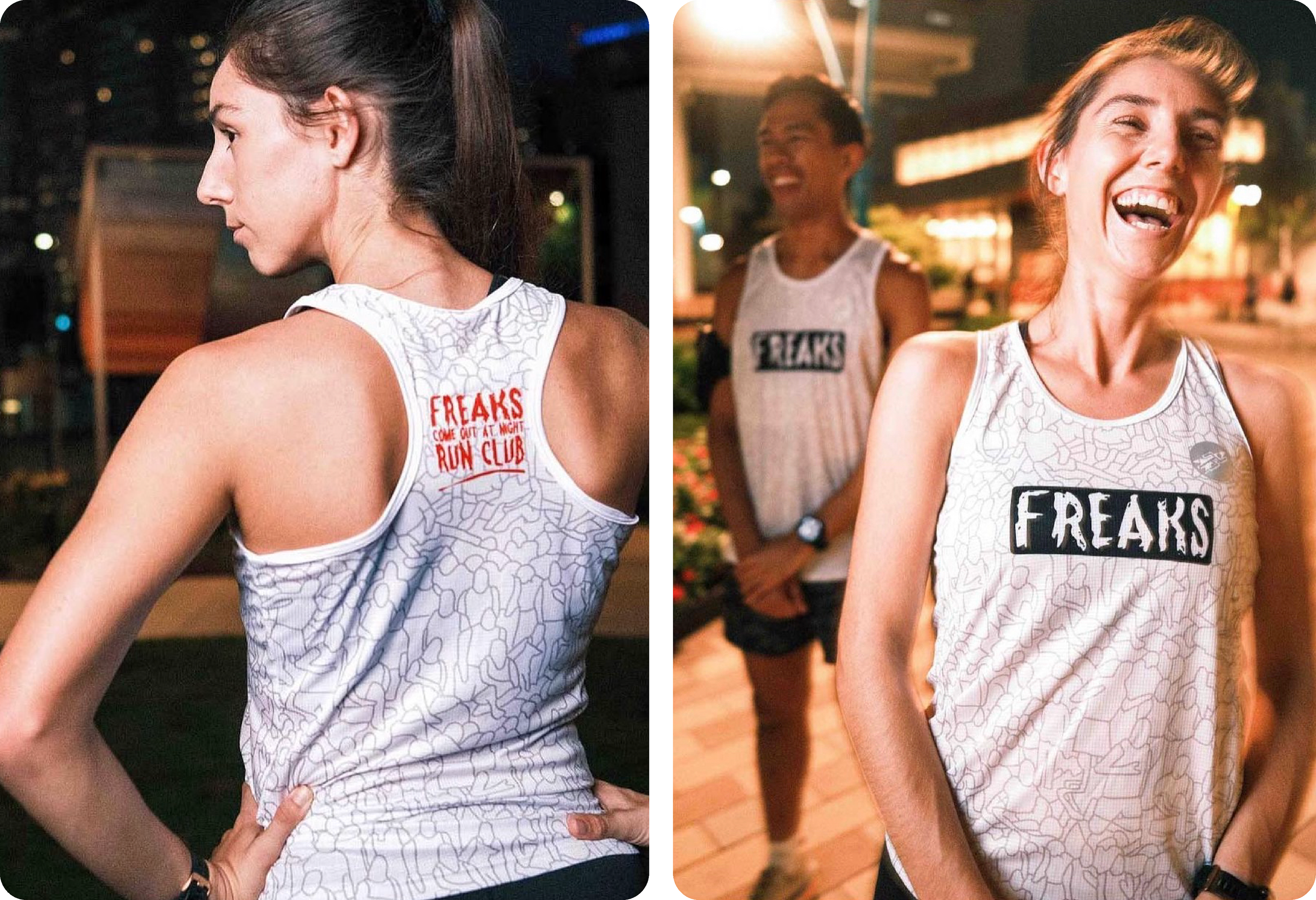
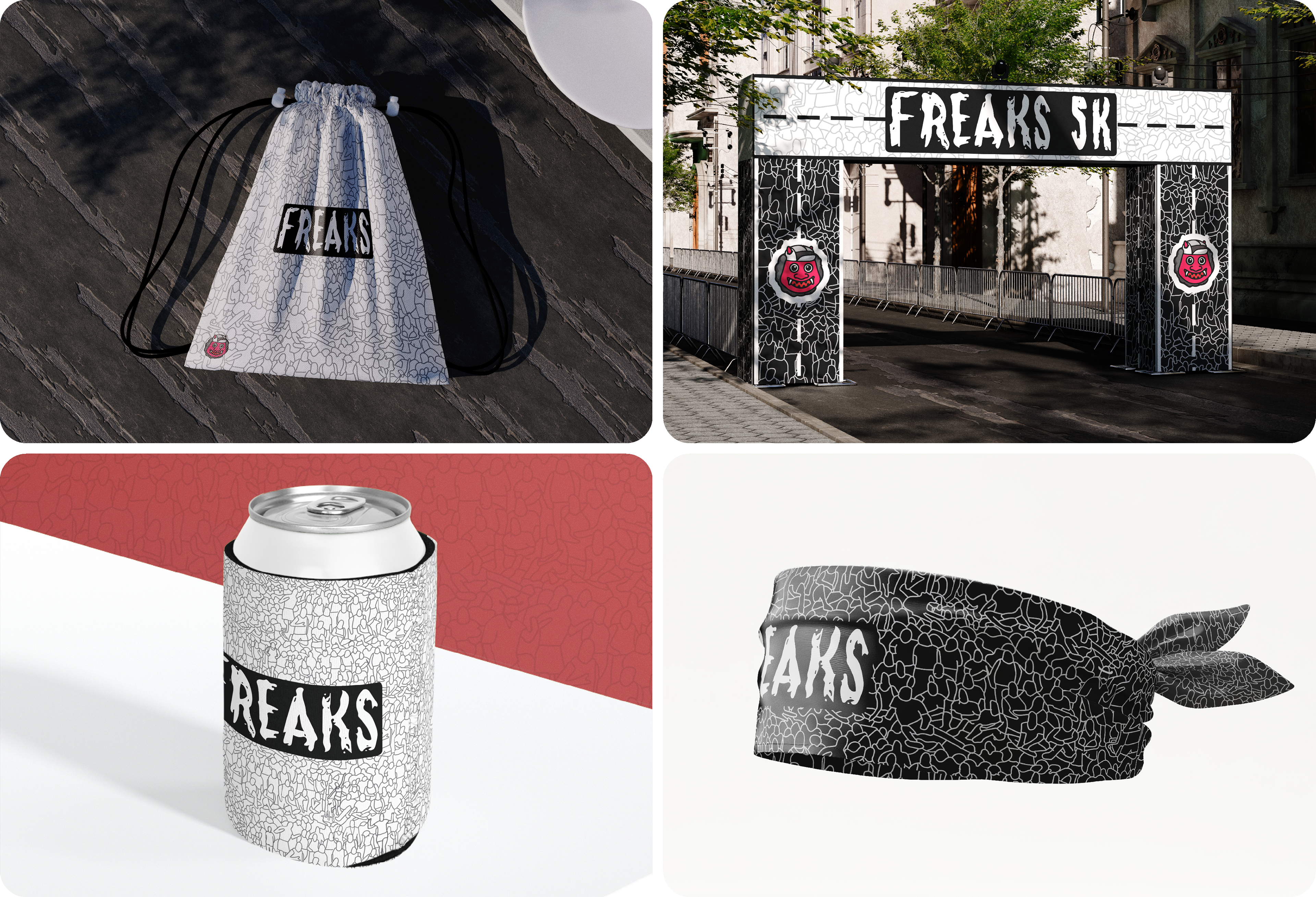
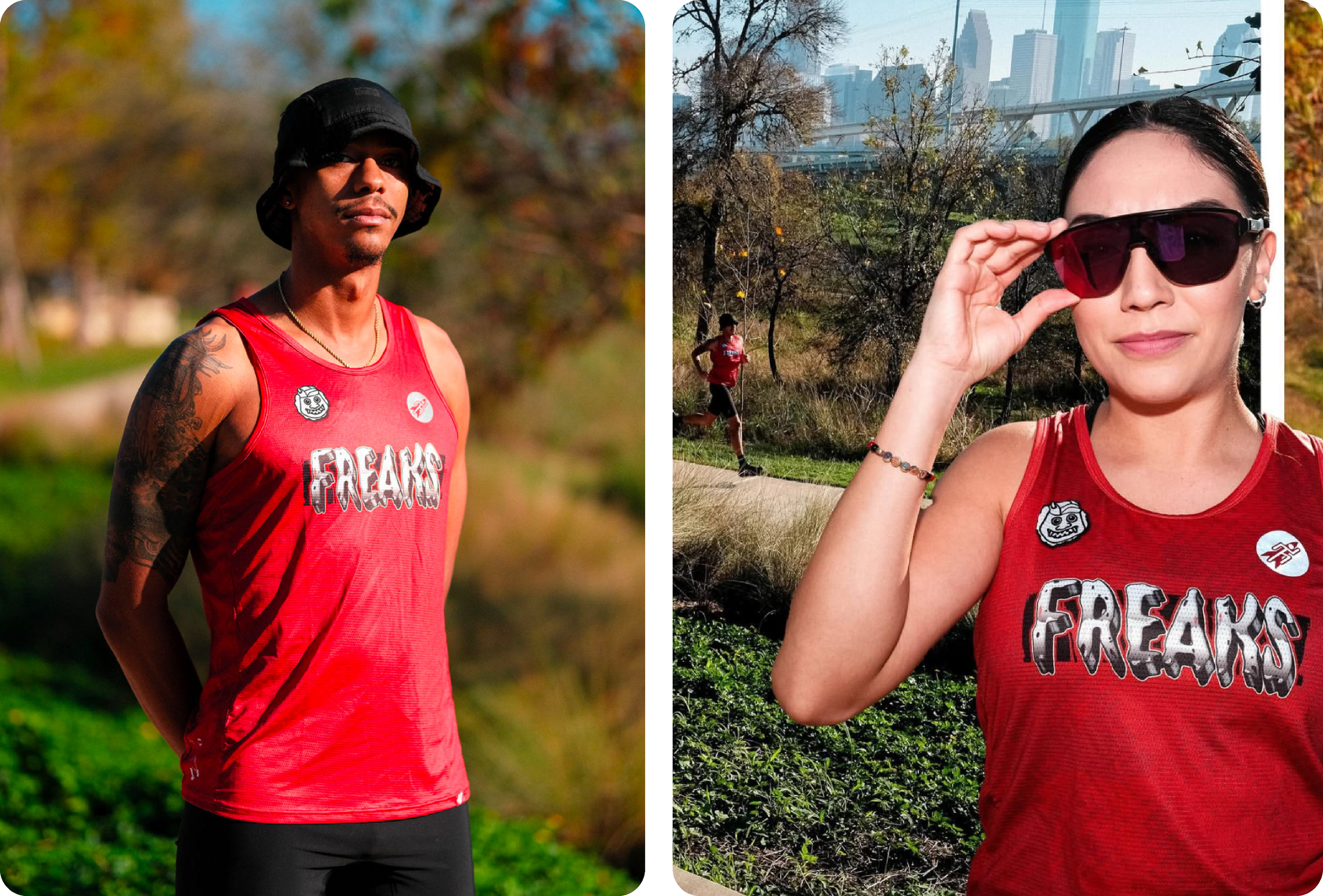
The final design quickly became a recognizable part of the club's presence, appearing at local races, weekly meetups, and even major running events throughout the nation. More than just a piece of apparel, the singlet gave members a shared visual identity; something that reflected the club's culture, values, and sense of community. By translating their personality into a distinctive design system, the project helped establish a stronger brand presence on race while acting as a mobile billboard for the club.
WORKING RELATIONSHIP WITH THE CLUB
After working together on the singlet, I have continued to partner closely with Freaks on a wide range of projects including race branding, custom merch, anniversary promotion concepts, and more. Under the singlet case study below, I've included a sample of other work that was inspired by this initial collaboration.

Group Picture
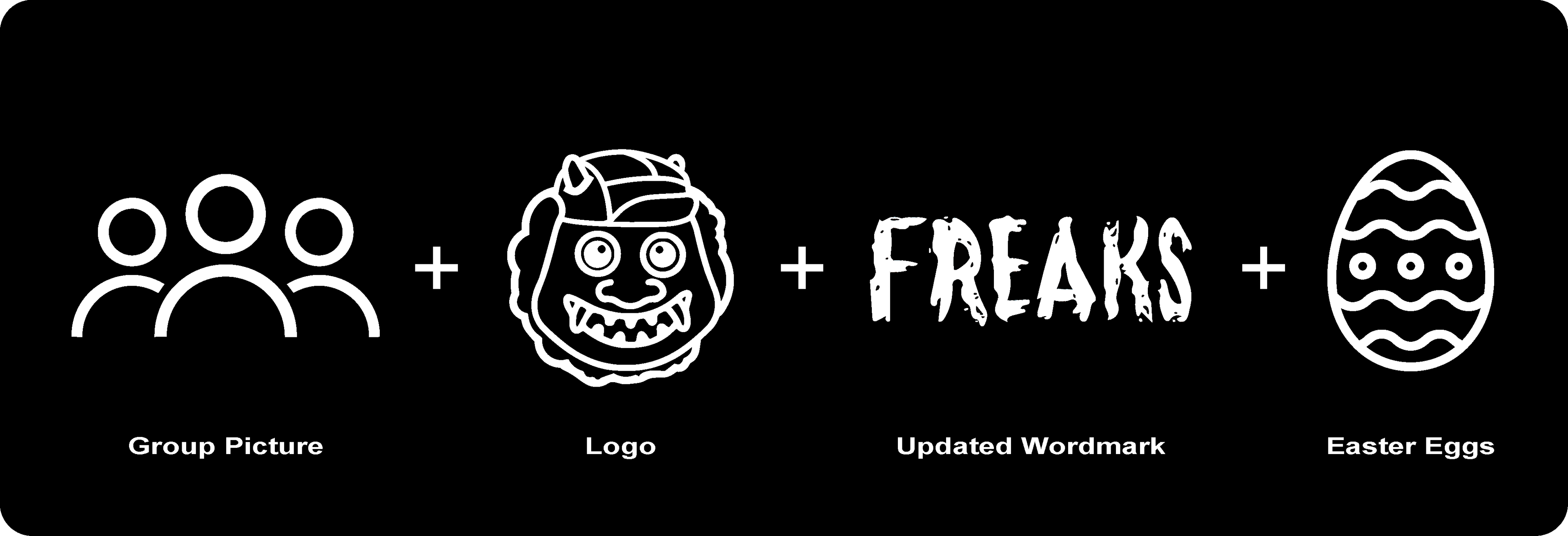
Every year on their anniversary, Freaks Run Club takes a group picture overlooking downtown Houston. To celebrate the people that make the club special, I created a hand drawn repeating pattern using the group photo as a reference.
Additionally, board members were added as easter eggs hidden within the pattern as a thank you for helping to make sure the club continues to grow while remaining a welcoming, supportive, and vibrant community.
Freaks Sticker
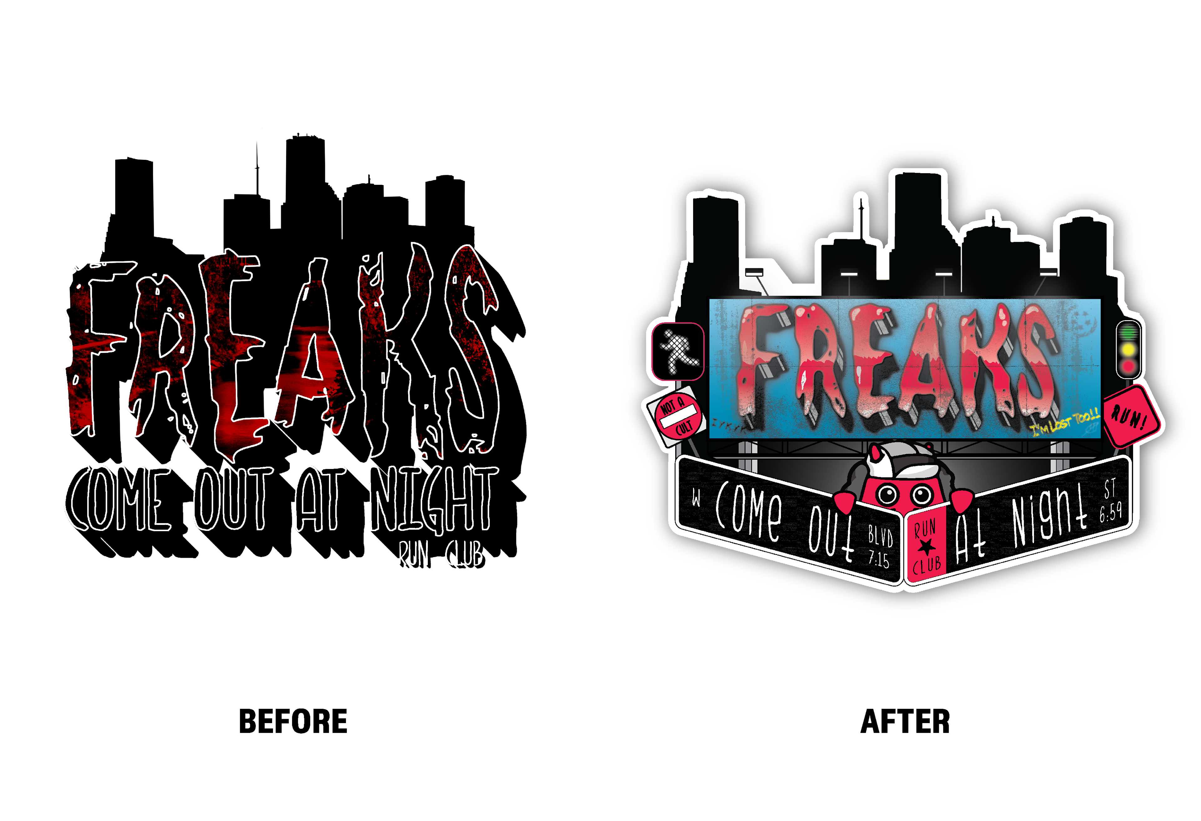
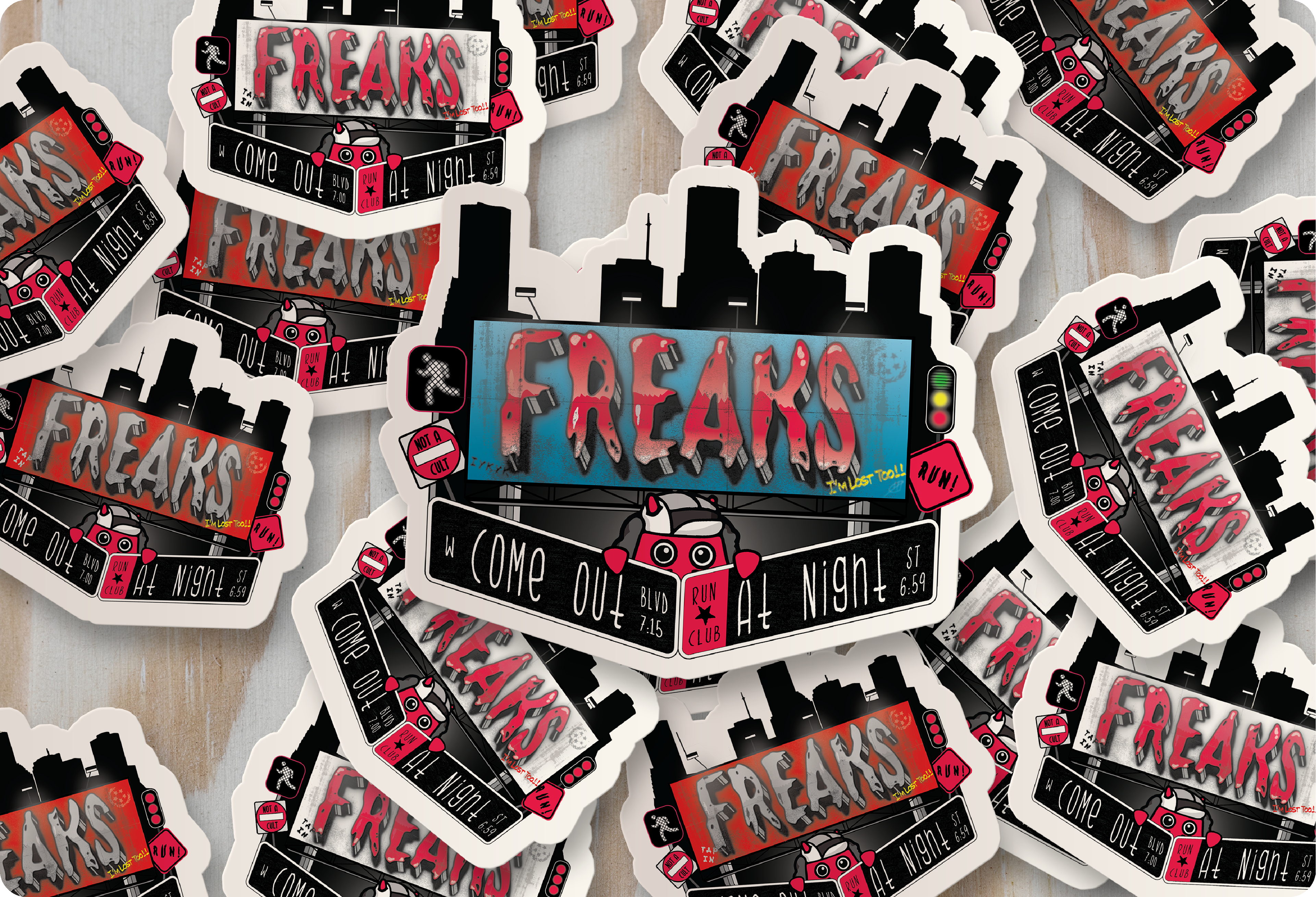
Freaks Run Club has a tradition of giving every first-time runner a special sticker as a special welcome to the community. After working together on their singlet, the club approached me with the idea of updating the original design in an effort to better reflect the club.
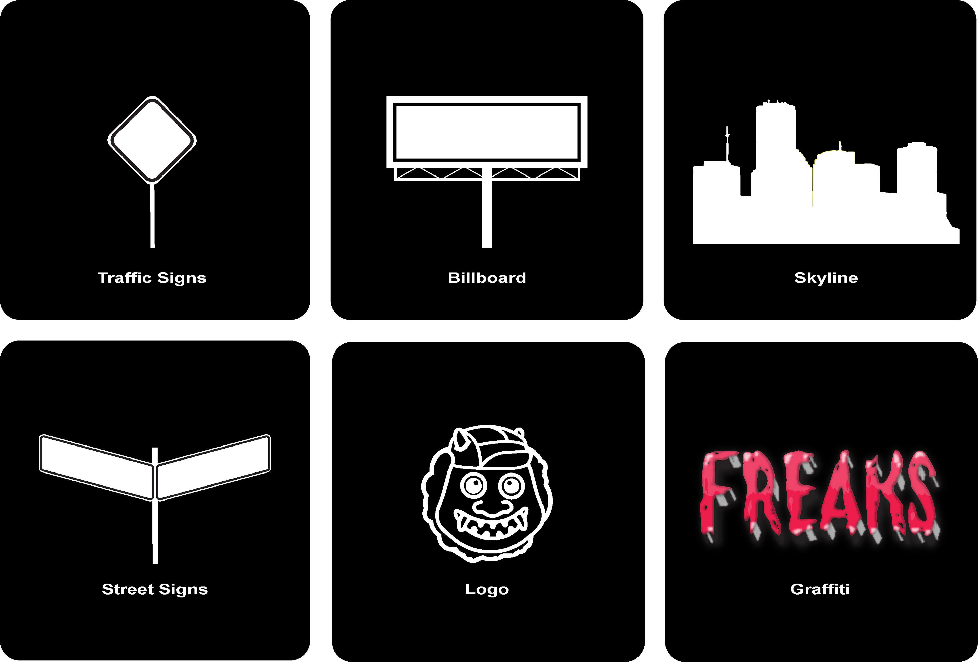
As we discussed concepts for the new sticker, a few key phrases quickly stood out, including "community", "exploration", "inclusion", and "playful." Working with those concepts, we then dug deeper into the concept of how the Freaks create the feeling of being at home anywhere within the city. The final design direction centered on the theme of: "We know what it looks like when Freaks run the streets, but what would it look like if the streets were made for Freaks."
Every element in the design plays into that idea including street signs, traffic signs, and a billboard covered in club references and inside jokes. They’re the "sign" that the club belongs here and that the city reflects who they are. By identifying a new story and finding a unique design hook, we were able to take the previous sticker and transform it brighter, more vibrant, and more representative symbol of the club.
Freaks X Urban South Brewing
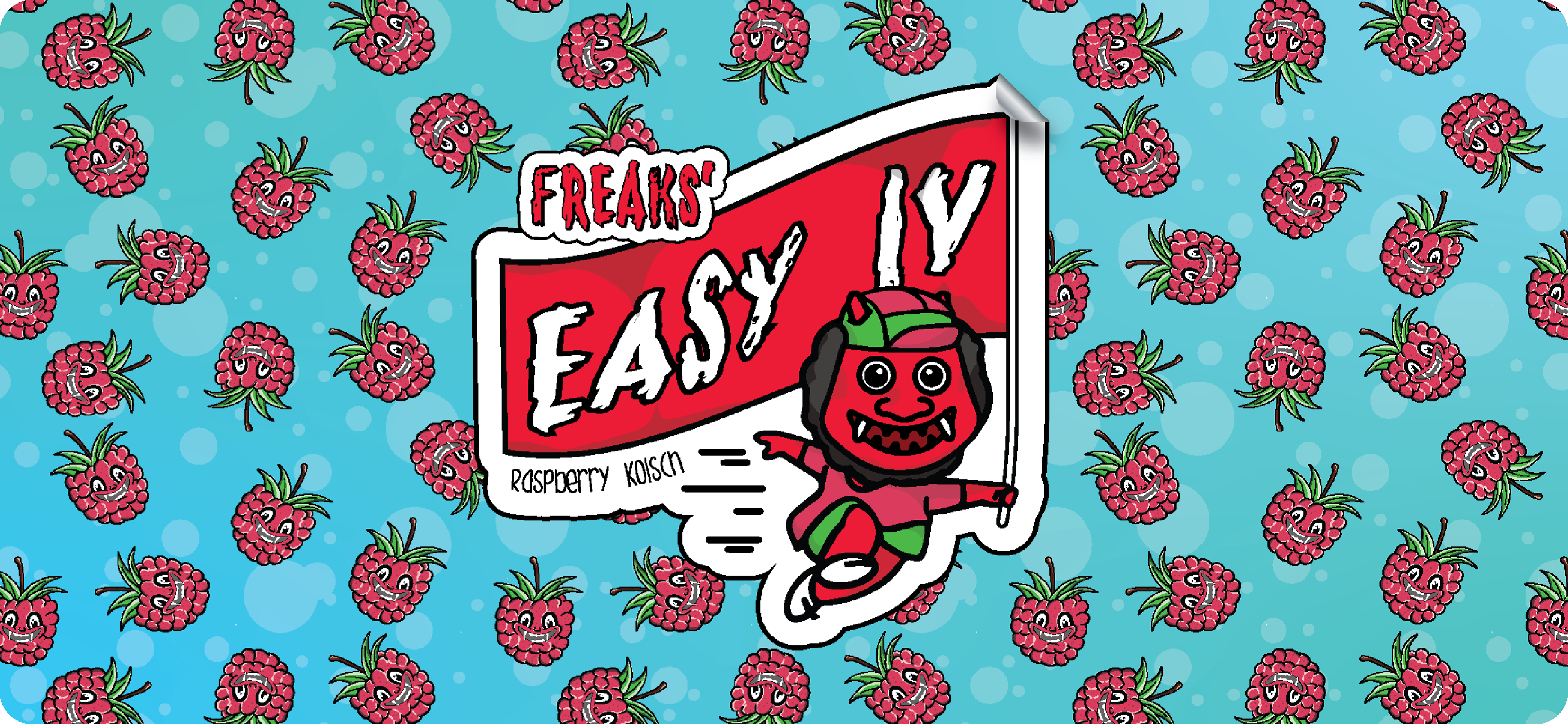
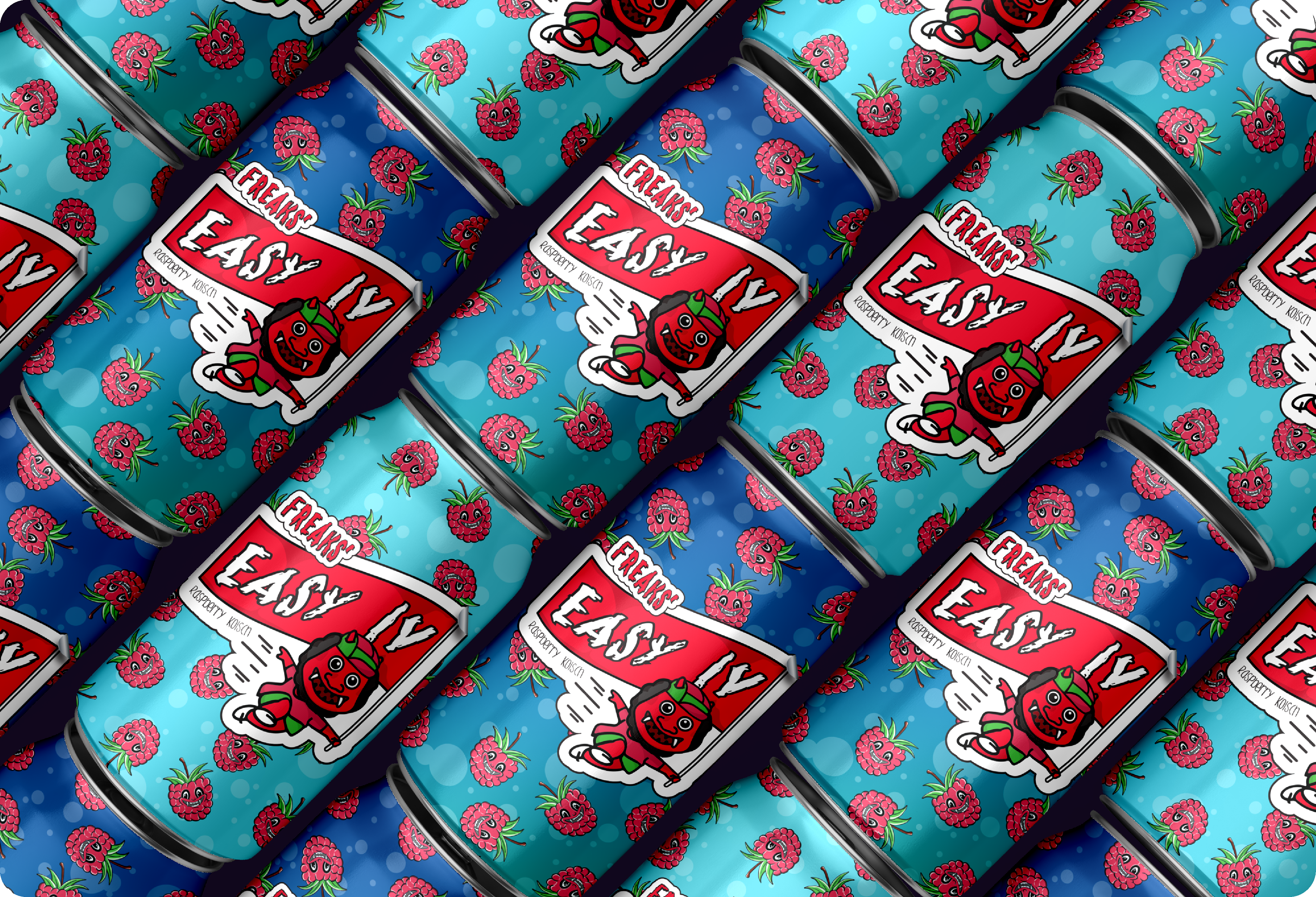
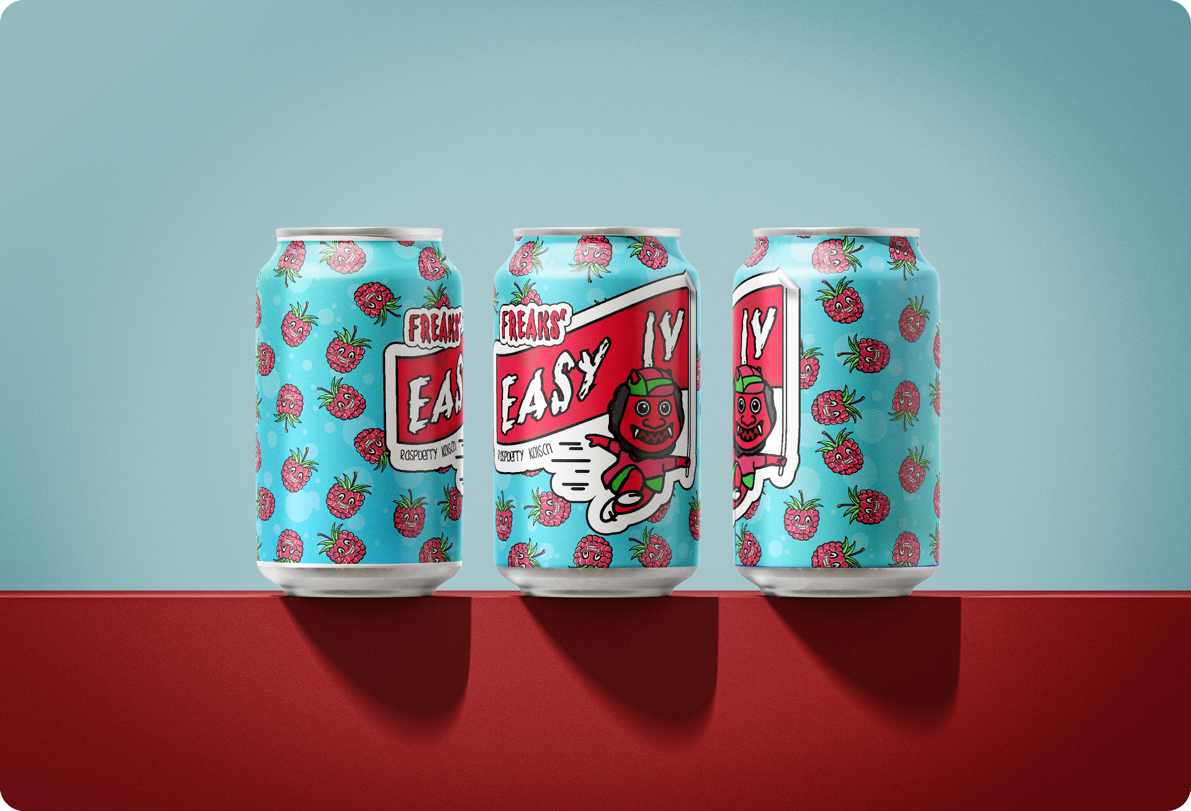
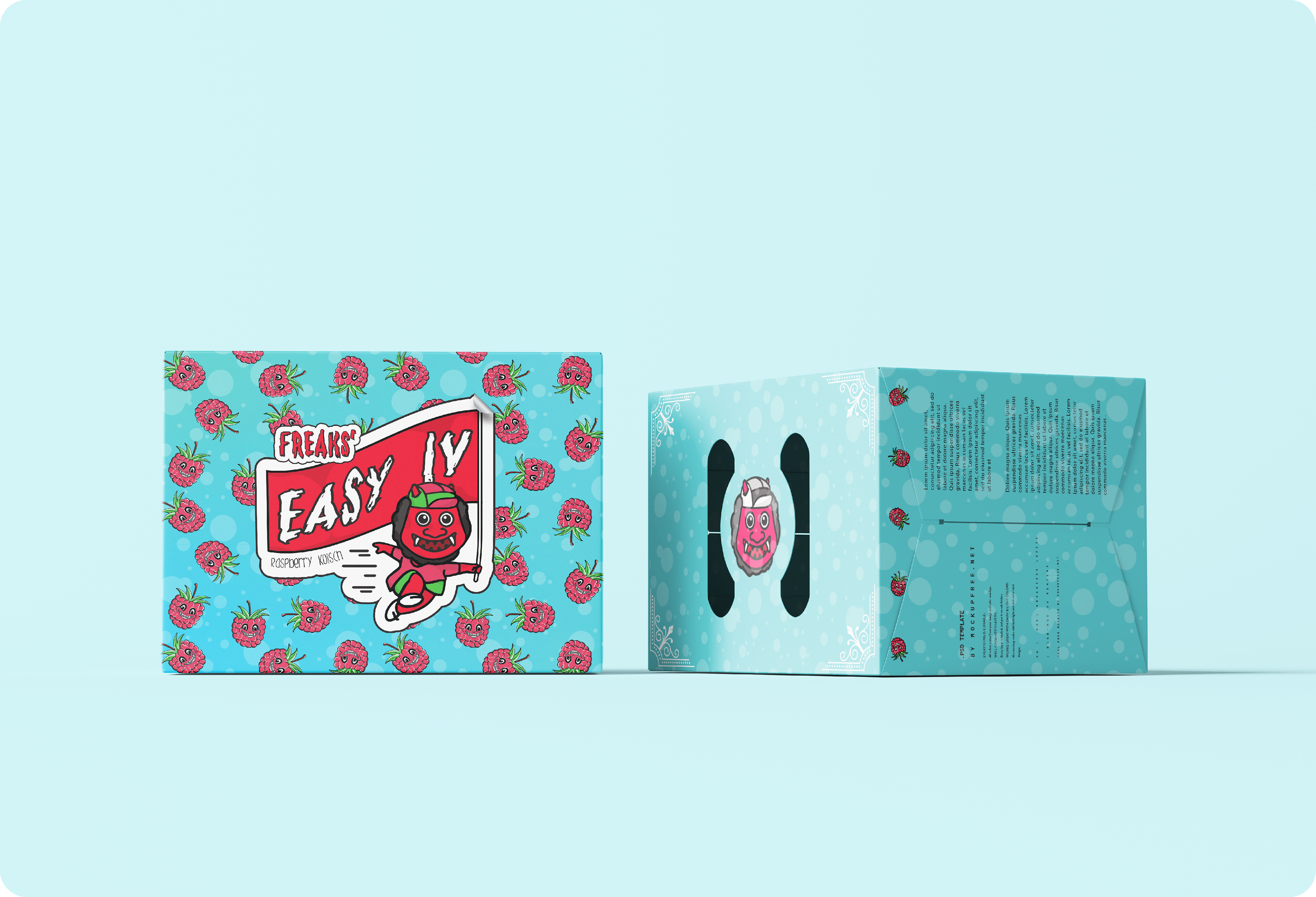
For it's fourth anniversary, Freaks Run Club partnered with Urban South Brewery to host a special run along with a new beer release. To help promote the event and further highlight their partnership, they needed a unique beer label to showcase elements of both the brewery and the club
I was tasked with coming up with a beer name, design concept, and final execution that matched the energy and vibrancy of the brewery as well as the humor and running identity of the club.
The name, "Easy IV" is based on a popular phrase within the running crew. Each weekly social run includes a 4 mile route, and even in the peak of Houston summer, members will show up saying that they're there for an "easy 4 miles." The name also plays on the easy-drinking style of a raspberry kolsch.